
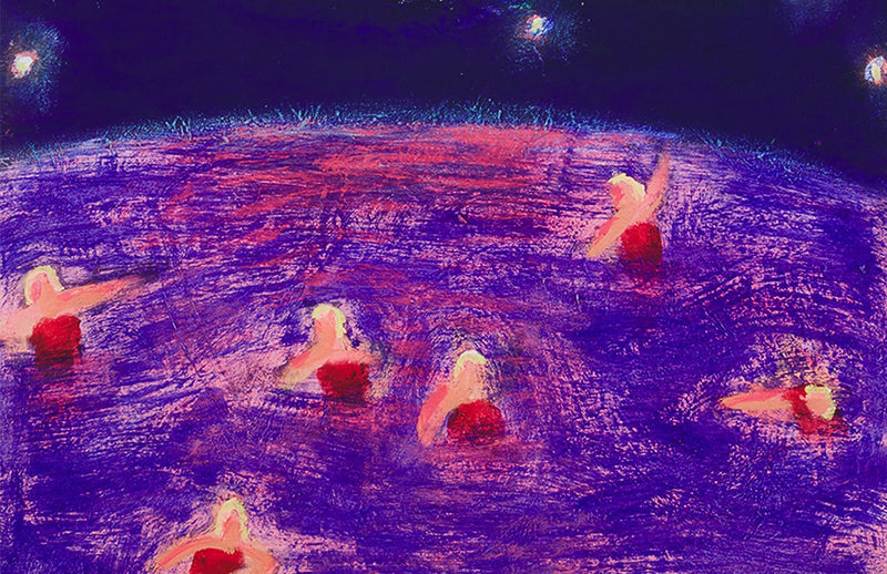
Katherine Bradford has emerged as one of the most quietly transformative painters of her generation: part dreamer, part chronicler of the everyday, always luminous. Her practice is not merely about paint on canvas, but about the act of imagining, of belonging, of seeing bodies afloat in space, water, and atmosphere. From her radiant swimmers and cosmic figures to her tender depictions of community, Bradford has made wonder, vulnerability, and togetherness the very material of her art. In doing so, she has redefined what it means for painting to hold both intimacy and universality.

In context
A Painter of the Possible
Bradford came to painting later than many of her peers, building her career outside of art world orthodoxies, and in doing so forged a path that feels distinctly her own. Her swimmers, often rendered with awkward limbs and glowing torsos, resist the polished realism of traditional figure painting. Instead, they inhabit seas of colour with vast pools of red, pink, turquoise and indigo, where bodies drift, float, or sometimes simply glow.
If some see naïveté in her deliberately simplified figuration, others see liberation. Bradford’s art makes visible a kind of freedom that painting has rarely allowed itself to imagine. Her canvases are not about virtuosity, but about possibility.

The Language of Light
What makes Bradford’s work endure is not just its dreamlike imagery, but the atmosphere she conjures. Her colours radiate warmth and mystery at once; her brushstrokes are both playful and profound. These are paintings that balance intimacy with expansiveness, as if we are looking not just at figures but at entire emotional worlds.
Her swimmers, superheroes, and night scenes feel archetypal yet personal. They invite us in, not as distant observers, but as fellow travellers, immersed in the same waters, gazing up at the same night sky. The paintings are tender without sentimentality, cosmic without abstraction.
 Stripe People, 2021
Cultural Resonance
Few artists have reimagined the figure in painting with such generosity, and fewer still have done so while focusing on queerness, care, and community. Bradford’s art expands what figuration can mean: not the assertion of dominance, but the expression of interdependence. She has legitimised vulnerability, joy, and eccentricity as profound painterly subjects. In doing so, she has opened space for artists who resist binaries of high and low, polished and deliberately awkward, heroic and humble.
If earlier critics underestimated her work as whimsical, it is now impossible to deny its gravity. Bradford’s paintings remind us that the imagination itself is radical, that softness can be as expansive as any grand narrative.

Conclusion
To step into Katherine Bradford’s world is to enter a universe suffused with light and possibility. Her swimmers, heroes, and dreamers do not dominate the canvas but dissolve into it, as if painting were a shared horizon rather than a solitary act. Bradford does not offer us perfection or resolution, but something rarer: a vision of coexistence, luminous and fragile, buoyant and brave. Her art, at its core, asks us to see ourselves as part of something larger—adrift, together, in the vast sea of being.
A colour field can hold a body without fixing a place
Bradford's figures may appear suspended in water, air or an atmosphere that remains difficult to name. The surrounding colour gives them a setting without always defining a conventional horizon or stable depth. This uncertainty can make a body seem vulnerable and buoyant at once. The viewer recognises a person while continuing to work out the space that holds them.
Look at the boundary between figure and ground. Is it firm, softened or partly absorbed? A small change there can alter whether the body seems to float freely or dissolve into its surroundings. The emotional effect emerges through that relationship, not only through the subject's pose.
A group is made through intervals
Several figures on one surface do not automatically form a coherent community. Their distances, directions and relative sizes establish whether they appear connected, isolated or only temporarily sharing space. Bradford's simplified bodies make those intervals particularly important. The space between people can be as expressive as a gesture.
Try following the route your eye takes from one figure to another. Does the composition encourage a group reading, or return you to an individual? Does colour connect separated bodies? These observations give substance to ideas of care and togetherness without assuming that every image illustrates a single, settled social message.
A print creates its own atmosphere
When an image moves into an edition, paper, ink and scale shape the encounter. The appearance of a painted surface may be translated, but the print should not be described as though it physically contains the original layers of paint. Read the exact process and support, then assess how colour and contour operate in that format.
Explore the Katherine Bradford collection alongside the digital print guide. Request complete photographs and condition information where a subtle colour relationship is central to the image. A clear account of the object allows its open, uncertain space to remain an artistic quality rather than a vague catalogue description.
Return to the image after a pause and notice whether the same figure attracts your attention. A changing point of entry can reveal how colour connects the composition beyond its most immediately recognisable subject.
Related reading
- David Hockney’s Landscapes: Roads, Seasons and Shifting Perspective
- Gerhard Richter’s Abstract Language
- Why Yoshitomo Nara’s Figures Feel So Alive
Figures held by colour
Bradford’s swimmers, boats and suspended bodies are often described as dreamlike, but their emotional force comes from how figures are placed within fields of colour. Scale and distance can make a person seem protected, exposed or lost. Narrative remains open, allowing ordinary actions to carry tenderness and uncertainty.
Works on paper and editions
When considering a print or work on paper, identify the exact medium, dimensions, date, edition, signature, printer and publisher. Colour fidelity is essential because subtle relationships may establish the entire atmosphere. Examine paper, surface, margins and fading, and avoid assuming that a printed image is simply a reduced substitute for a painting with a similar subject.


Leave a comment
This site is protected by hCaptcha and the hCaptcha Privacy Policy and Terms of Service apply.