
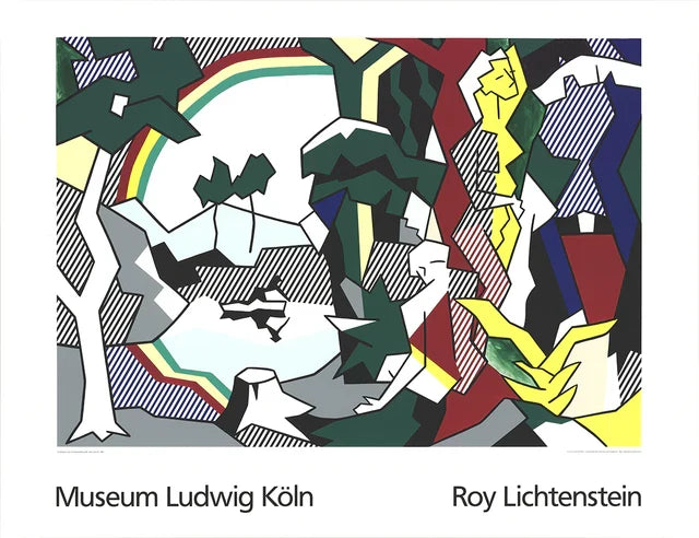
How Roy Lichtenstein transformed horizons, reflections and natural scenery into a distinctly artificial Pop language.

Nature after mass media
Roy Lichtenstein’s landscapes and seascapes look outward to sky, water and horizon, but they rarely offer untouched nature. They present scenery already filtered through printing, advertising and the visual shorthand of popular culture. Sunsets become stripes; reflections become repeated marks; clouds and rainbows are reduced to graphic devices. The result is both familiar and deliberately artificial.
The horizon as a structure
A landscape can be organised by one of the simplest divisions in art: a horizontal line separating sky from land or sea. Lichtenstein uses that division with unusual economy. Above and below it, dots, bands and flat colour create different kinds of visual density. The viewer recognises a place even when conventional depth has almost disappeared. This tension between spatial illusion and flat surface is central to the work.
Cliché used intelligently
Rainbows, sunsets and sparkling water can carry sentimental associations. Lichtenstein does not avoid that sentiment; he isolates it. By borrowing the ready-made signs through which commercial imagery tells us that a scene is beautiful, he asks how visual conventions produce feeling. A rainbow may seem cheerful and immediate, yet its perfection also reveals the constructed nature of the scene.
Materials change the view
In his landscape-related work, Lichtenstein experimented with print processes and reflective or industrial-looking surfaces. Even where a particular edition uses conventional paper, the image may evoke screens, mirrors or commercial printing. Light can appear less like atmosphere than a designed effect. That makes these works especially sensitive to display: even illumination and non-reflective glazing help preserve the clarity of the surface and allow subtle contrasts to remain visible.
Looking beyond the comic-book image
Collectors often meet Lichtenstein through his romance and war subjects, but the landscapes show how broad his enquiry became. The same disciplined vocabulary—outlines, dots, repeated marks and flat colour—could remake a genre with centuries of history. These images are quieter than the famous narrative pictures, yet their restraint can make them particularly effective in domestic settings.
What to consider when buying
Identify the exact work and publication rather than relying on a broad title. Check medium, dimensions, edition details, printer or publisher where recorded, and whether the sheet corresponds with recognised catalogue information. Examine margins, colour, surface and any signs of light exposure. An exhibition poster and an original limited-edition print may share an image but have different histories and market positions; the description should state clearly what is being offered.
An artificial sublime
Traditional seascapes often use atmospheric change to make nature feel boundless. Lichtenstein reaches a similar scale of feeling through visibly artificial means: bands, dots and graphic reflections. The contradiction matters. We recognise a sunset or horizon while remaining aware of a printed code. Beauty survives, but it is presented as something learned through images as well as encountered in the world.
Further research
The question remains active whenever gesture or landscape becomes a reproducible sign.

Leave a comment
This site is protected by hCaptcha and the hCaptcha Privacy Policy and Terms of Service apply.