
Colour is often the first thing that draws us to a Damien Hirst print. A clear field of spots, a dense arrangement of butterfly wings or a sharply organised chart can register immediately across a room. Spend more time with the image and its construction becomes more interesting: how the colours are separated, where the pattern tightens, how much the surface catches the light, and whether the eye is encouraged to settle or keep moving.
Our Damien Hirst selection brings those different experiences together. Looking across the works offers a useful way into his editions, through their visual character rather than through a single signature motif. Paper, polished panels, glitter and enlarged details each give colour a different physical presence. For a collector, those distinctions can be as compelling as the image itself.
Start with the rhythm of colour
A spot composition gives the eye an unusually clear structure. Each circle is easy to recognise; the relationships between them are less predictable. A dark colour may hold a row in place, while a pale one appears to recede. White space matters too. It keeps neighbouring colours apart and gives each interval a role in the image.
Hirst has explored the format across radically different scales. Gagosian's 2012 presentation of the Spot Paintings ranged from a work smaller than a square inch to paintings with thousands of tiny spots. That range is a reminder to look closely at the particular arrangement rather than treating every spotted image as visually equivalent.
In Norcamphor, four large circles of blue, yellow, red and green surround an open white centre. Consider the relationship between those forms and the sheet around them. The question is straightforward: which colours keep bringing your eye back? A composition that seems simple at first can become a particularly engaging work to live with because those small relationships remain open to rediscovery.

The colour chart as an image
Hirst's Colour Chart works take another familiar organising device and give it sustained attention. HENI connects the everyday commercial paint chart with the artist's wider interest in colour in its account of the 2017 Colour Chart edition. The printed chart offers a different way to organise colour from the separate circles of the spot works.
The chart format makes comparison almost irresistible. We read across it, isolate a colour, then return to the whole. Its orderly presentation suggests that colour can be named, arranged and made manageable, yet our preferences remain personal. One viewer may find a particular passage balanced; another may be drawn to a colour that interrupts it.
This makes the work especially rewarding beside a more expansive or gestural image. The chart introduces a measured pace. Its familiar structure offers an immediate point of entry, while the accumulation of differences prevents the image from becoming a single flat block of colour.
Paper, proportion and a quieter scale
The 2011 40 Woodcut Spots series offers a particularly useful comparison within one print project. Paragon's catalogue identifies both Norcamphor and Picolinic Acid as part of the series, recording a square sheet for the former and an elongated horizontal format for the latter.
That change of proportion matters before any individual colour is considered. In Picolinic Acid, a red circle sits towards the left and a mint-green half-circle is cropped at the right edge. The open interval between them gives the eye space to travel. The cut form also suggests a continuation beyond the sheet, an effective contrast with the contained four-part arrangement of Norcamphor. A square gives the composition a centred presence; a long, shallow sheet encourages a lateral reading. Compare Picolinic Acid with Norcamphor and consider how each might sit within a group of works. Their shared vocabulary allows a connection, while their different outlines can establish a more varied arrangement.
Paper also introduces a distinct relationship between artwork and presentation. The sheet, surrounding space and choice of frame all contribute to the encounter. It is worth seeing a work at its intended scale rather than relying solely on a tightly cropped catalogue image.

A wider field: The Kaleidoscopes
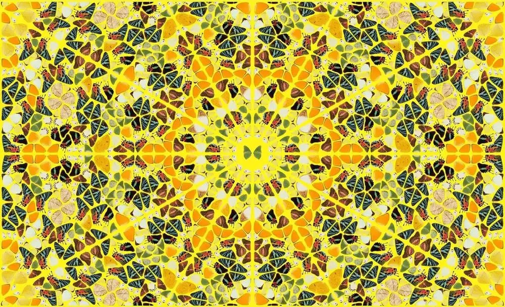
Hirst returned to the butterfly in the five-print Kaleidoscopes series of 2024. HENI records these as Diasec-mounted giclée prints on aluminium composite panel, measuring 85 × 140 cm. The publisher connects their geometric arrangements with Victorian objects decorated using butterfly wings, including tea trays. That history brings a specific context to the relationship between natural detail and designed pattern. See HENI's introduction to the series.
Splendour, with its vivid yellow ground and radiating butterfly arrangements, invites a broad sweep of the eye. Compare it with Psychedelic to see how a related format can sustain different colour relationships. The landscape proportions give the repeated forms room to extend sideways. Rather than taking in the composition from a single fixed point, try following one element into its neighbours, then stepping back to see the structure reassemble.
For a collector drawn to density and detail, this movement between the part and the whole is a substantial part of the appeal. It gives the image different registers at different viewing distances.

The surface has its own role
The chart format gains another dimension in Colour Chart (Glitter) (H3). Here, Hirst brings another material into play. HENI records the glitter version as a screenprint with glitter on a UV-printed brushed aluminium panel.
Glitter makes light an active part of the viewing experience. It can draw attention towards the physical surface, where a flatter printed passage might encourage the eye to move straight through the colour. That difference becomes more apparent as the viewer changes position. A single frontal photograph will not communicate every aspect of that encounter.
For anyone choosing between related images, the finish deserves attention alongside the composition. You may prefer the clarity of a relatively even surface, or enjoy a work whose appearance responds more noticeably to its setting. Neither choice needs an elaborate explanation. The important point is to recognise that material is part of what makes the particular artwork appealing.
Reading the selection as a group
Viewed together, these works suggest several ways of organising a collection. One is to follow a motif through different forms. Another is to build around a particular colour relationship, allowing a measured chart and a denser butterfly image to speak to one another. A third is to use scale deliberately, giving an expansive work room to lead and smaller pieces a more intimate place.
Try considering two works without their titles for a moment. Does one feel concentrated and the other open? Does your eye move quickly across one and pause within the other? These are useful distinctions because they describe an experience rather than a hierarchy. A quieter work need not be a supporting piece, and a more intricate one need not dominate every setting.
The choice can also develop over time. A work you initially notice for its colour may remain interesting because of its intervals, structure or surface. That is a good reason to compare slowly, with room for preferences to become more specific.
Choosing a work to live with
Begin with the image you return to, then think about the kind of encounter you want it to create. A work seen chiefly from across a room will behave differently from one hung where its surface can be examined closely. Consider the proportions of the wall, the usual viewing distance and the direction of natural light. A broad horizontal panel and an intimate work on paper make different demands on a space.
There is no need to build a group around a single series. A spot print and a butterfly composition can share an interest in repeated forms while bringing quite different rhythms. Equally, two related works may reveal differences that are less apparent when each is considered alone. Let the comparison sharpen your preference rather than assuming that a matching set is always the most persuasive arrangement.
Our selection is an invitation to make those comparisons. Explore the Damien Hirst works at Dovehouse Contemporary, or contact a member of our team for more details on a particular work or to discuss a focused selection. The strongest starting point is often a clear response to one image: its colour, its scale, and the way it holds your attention.


Leave a comment
This site is protected by hCaptcha and the hCaptcha Privacy Policy and Terms of Service apply.