
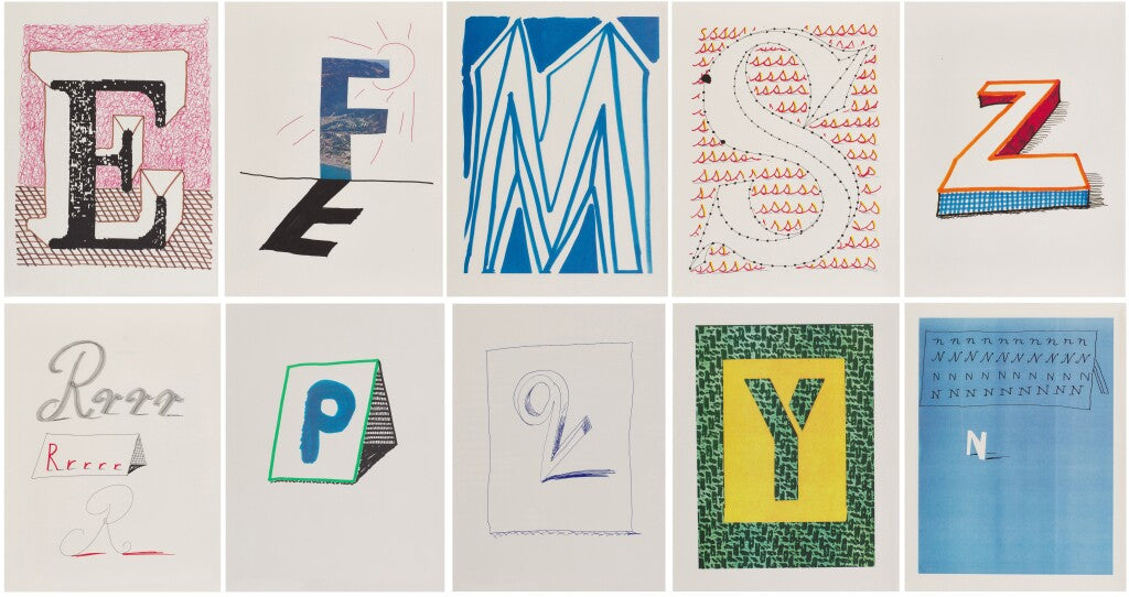
An alphabet has a fixed order, but it leaves plenty of room for invention. In Hockney’s Alphabet, each letter becomes an image alongside a writer’s contribution. The pleasure is in seeing how a familiar symbol can carry Hockney’s drawing and still leave space for someone else’s words.
Published in 1991, the Alphabet Series is far more than an illustrated alphabet. Comprising twenty-six individual colour lithographs—one for every letter—the project reflects Hockney's lifelong fascination with drawing, language and visual storytelling. Rather than producing literal illustrations, Hockney transformed each letter into an imaginative composition, where typography, landscape, architecture, figures and symbolism merge into playful, richly layered works of art. The portfolio was conceived as a charitable project to raise funds for the AIDS Crisis Trust, with each letter accompanied by an original text by a leading writer, assembled by the poet Sir Stephen Spender. Contributors included some of the most celebrated literary voices of the twentieth century, creating a remarkable dialogue between image and word.

A Different Side of David Hockney
Although Hockney is widely regarded as one of Britain's greatest painters, printmaking has always occupied a central place within his practice. From his celebrated A Rake's Progress etchings to the Blue Guitar series, he has consistently used the print medium not simply to reproduce images, but as a creative discipline in its own right.
The Alphabet Series demonstrates this perfectly. Each composition possesses an immediacy and spontaneity that belies the technical precision required to produce a colour lithograph. Hockney uses line with extraordinary confidence, allowing the viewer's eye to move effortlessly between recognisable forms and abstract marks. Every letter becomes a miniature world, inviting repeated viewing and fresh interpretation.
Rather than imposing a single narrative, Hockney encourages viewers to make their own connections. A letter may evoke travel, memory, landscape, architecture or personal relationships, reflecting the artist's belief that drawing is ultimately a way of seeing rather than merely recording.

Where Art Meets Literature
One of the most distinctive aspects of Hockney's Alphabet is its collaboration with literature. Each lithograph is paired with a specially commissioned piece of writing by an acclaimed author, creating an unusually rich conversation between visual art and the written word.
The project reflects Hockney's enduring love of books and storytelling. Throughout his career he has illustrated poems, fairy tales and literary classics, believing that images and text can enhance one another without either dominating. In Hockney's Alphabet, that relationship is particularly successful, resulting in a portfolio that appeals equally to collectors of prints, literature and modern design.

Why Collect the Alphabet Series?
The enduring appeal of Hockney's Alphabet Series lies in its accessibility. Each work is immediately engaging, yet reveals greater complexity over time. The images are playful without being simplistic, sophisticated without being inaccessible.
Unlike many editioned print portfolios that are intended to be viewed only as complete sets, the individual letters possess a strength and identity of their own. Collectors are often drawn to particular letters because of personal significance—a family surname, a meaningful initial or simply a composition that resonates aesthetically.
From a collecting perspective, the series also occupies an important place within Hockney's graphic oeuvre. Produced in an edition of 250, the works are recognised as one of his most distinctive print portfolios from the early 1990s and continue to attract interest from both established Hockney collectors and those acquiring their first work by the artist.

A Portfolio That Continues to Delight
More than thirty years after its publication, Hockney's Alphabet remains as fresh and inventive as ever. It captures everything that makes David Hockney one of the defining artists of our time: technical brilliance, curiosity, wit and an unwavering belief that art should invite us to look more carefully at the world around us.
In an era increasingly dominated by digital imagery, these beautifully crafted lithographs serve as a reminder of the enduring power of drawing, printmaking and imagination. Whether displayed individually or appreciated as part of the complete portfolio, Hockney's Alphabet continues to offer collectors a rare combination of artistic significance, visual delight and timeless appeal.
Read the letter as a shape before reading it as language
An alphabet is one of the most familiar systems we encounter, which makes it a productive subject for visual reinvention. The viewer recognises a letter before considering how it has been drawn. Hockney can work within that recognition, allowing a curve, diagonal or vertical to become a pictorial event without making the character unreadable.
Compare D and K as compositions rather than merely as initials. Consider the balance between the drawn form and the space around it, the direction of its movement and the way colour separates or joins its parts. A personal connection to a letter may begin the attraction, but the individual image needs to sustain that interest visually.
The sequence of an alphabet also gives the project a structure independent of a conventional story. The next page follows a rule the reader already knows, while the image can introduce an unexpected interpretation. That balance of familiarity and invention helps explain why an alphabet can support a serious exchange between drawing and writing.
Understanding a sheet from a signed publication
The format of the offered object is important. A complete publication, a portfolio and an individual sheet should be described in their own terms. When a work is presented separately, establish its relationship to the original publication and what accompanying material remains with it.
Dovehouse’s current descriptions of the D and K sheets state that the artist and editor signed the justification page, with a copy of that page included with the artwork. This is a specific publication-level signing arrangement. It should not be shortened into a claim that the individual sheet carries an original signature. The location and form of the signature are part of the object’s identification.
Ask for the complete sheet dimensions, a photograph showing the margins and an explanation of any mounting or separation from the publication. Keep the supplied documentation with the invoice. These details allow the work to be appreciated both as an individual image and as a component of a collaborative publishing project.
For display, leave enough room for the letter’s surrounding space to remain visible. An initial can have a strong decorative presence, but a close encounter with the drawing offers more: small decisions of line and proportion turn a familiar symbol into a picture worth returning to.
Browse the David Hockney collection to compare available letters with other printed work. A letter’s attraction is visual, but its place in the original publication and the form of any accompanying signature are part of an accurate description.

Leave a comment
This site is protected by hCaptcha and the hCaptcha Privacy Policy and Terms of Service apply.