
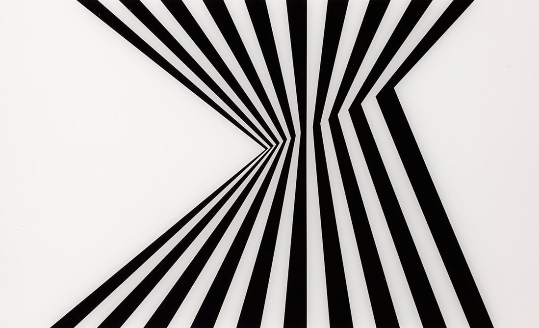
Bridget Riley’s prints are not reproductions of optical effects first solved elsewhere. Printmaking gives her a distinct field in which line, interval, colour and paper can be organised with exceptional precision. The resulting images may appear to shimmer, advance or curve, yet their most important movement occurs in the act of looking.
Beyond the Op Art label
Riley became closely associated with Op Art during the 1960s, but the label can encourage a narrow emphasis on illusion. Her work is less concerned with tricking the eye than with revealing its activity. We scan, compare, adjust and remember; repeated units become unstable because vision is never perfectly still.
That instability is carefully constructed. A change in spacing can create acceleration. A curve can make a flat field appear to swell. Alternating black and white can produce flashes that are not physically printed on the sheet. The picture remains materially exact while the experience refuses to settle.
Black, white and interval
The early monochrome works demonstrate that colour is not required for intensity. Black and white establish maximum contrast, but the active element is often the interval between forms. Riley varies width, direction and sequence so the eye cannot adopt a single comfortable reading. The image is simultaneously a fixed arrangement and a changing perceptual event.
Colour as relationship
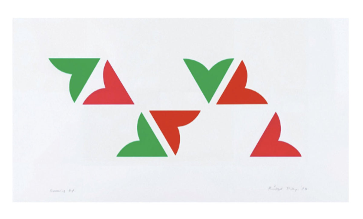
When Riley introduced colour, she did not simply fill existing structures with brighter hues. Colour created a new problem: each band or shape alters the appearance of its neighbours. Warmth, coolness, density and apparent light emerge through adjacency. A printed colour therefore has both a physical identity and a relational one.
Why printmaking suits Riley
Print processes allow controlled repetition, clean edges and carefully calibrated colour. They also introduce their own material facts: paper tone, ink surface, scale and margin. A successful edition is conceived around those conditions. Looking closely at an impression reveals that precision is not the opposite of sensation; it is the framework that makes sensation possible.
How to look
Begin at a distance, allowing the composition to register as a whole. Then move closer and follow one line or colour through the sequence. Notice when the field appears to tilt, expand or pulse. Shift position and look again. These works are not exhausted by a frontal thumbnail because the viewer’s changing attention is one of their materials.
Collecting Bridget Riley prints
Check the exact title, date, technique, sheet and image dimensions, edition, signature, printer and publisher. Related compositions may appear in posters or publications, and they should be distinguished from original editioned prints. Colour stability, paper tone, registration, margins and previous framing are particularly important. Poor glazing or prolonged light exposure can reduce contrasts that carry the work’s visual rhythm.
An art of sustained attention
Riley’s prints remain compelling because immediate visual pleasure leads to a deeper question: how much of an image belongs to the sheet, and how much is produced by the viewer? Their clarity does not make them simple. It gives us the conditions to watch perception assembling—and revising—the world in real time.
Nature without representation
Riley has repeatedly connected her understanding of colour and rhythm to experiences of the visible world, including changing light and the movement of landscape. Her prints do not depict those observations, but they can preserve their energy. This helps explain why the work feels bodily rather than merely mathematical: abstract structure is used to recreate the intensity of perception, not to withdraw from experience.
Framing and display
Give a Riley print enough surrounding space for its edges and rhythm to remain clear. Archival mounting and glazing should protect the sheet without introducing strong reflections that compete with the optical field. Lighting needs to be even and restrained. A frame can support the work’s precision, but heavy borders or coloured mounts may alter relationships the artist calibrated carefully.
Explore available works by Bridget Riley and read our retrospective on Bridget Riley: Learning to See at Turner Contemporary.
Give a sequence time to establish itself
Riley's work can make an immediate impression, but a longer encounter often changes what the viewer notices. At first a whole field may seem to move. Later, attention settles on a particular interval or colour relationship. The apparent movement can weaken, return or shift as the eye changes its route. The image remains fixed while the experience develops through time.
There is no requirement to force a particular optical effect. Different viewers may notice different relationships, and fatigue or surrounding light can alter the encounter. The useful task is to describe what you see and how it changes, rather than treating the work as a test with one correct visual response.
The margin establishes a threshold
The point where a repeated structure meets the surrounding paper can be especially active. The eye moves from a dense field into a quieter area, and the contrast can make the image seem more concentrated. A mount that covers the intended margin may change that transition. The complete sheet should therefore be understood before choosing a presentation.
Compare a full photograph with a cropped detail. The detail may reveal the precision of a line, but only the full view shows how that line belongs to a bounded composition. Both are useful, provided they are clearly identified and not mistaken for equivalent representations of the object.
Precision makes variation visible
When a composition establishes a strong rhythm, a small change can become unusually noticeable. A shifted interval or different colour may alter how the field seems to expand or contract. The viewer's expectation is part of the effect: regularity creates a pattern against which variation can be experienced. This is more complex than a formula that produces the same sensation every time.
The guide to lithography and screenprinting explains how different processes can support precise visual relationships. Read it alongside the medium of the particular Riley edition. The technique, paper and scale are part of the conditions under which the work is encountered, not incidental details added after the image is complete.
A Riley print rewards a combination of patience and specificity. Let the overall sensation arrive, then return to the actual colours, intervals and boundaries that make it possible.
Explore related works in the gallery
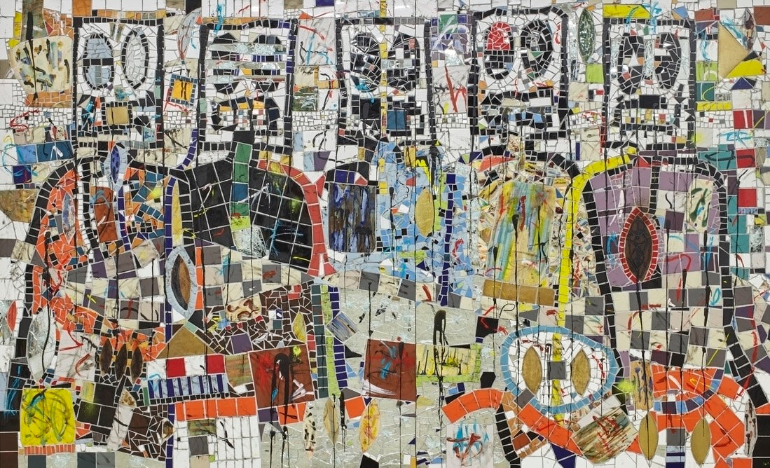
The following catalogue entries give the recorded medium, dimensions and edition details for related works. Consult each listing and request a condition report when comparing individual examples.

Leave a comment
This site is protected by hCaptcha and the hCaptcha Privacy Policy and Terms of Service apply.