
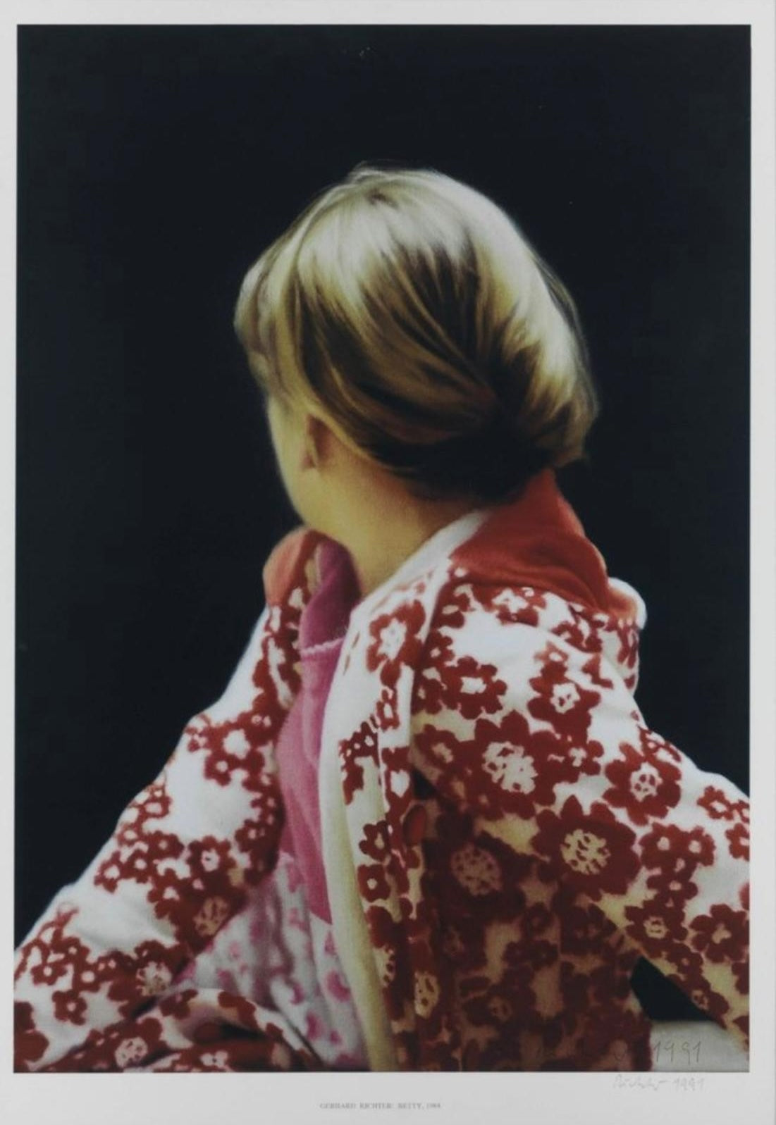
Gerhard Richter’s portraits are rarely straightforward acts of description. They often begin with photographs, but the result is not a simple transfer from camera to paper. Richter introduces distance: a turn of the head, a softened edge, a printed surface that reminds you that you are looking at an image of an image. For collectors, that is precisely what makes his portrait editions interesting. They are portraits, but they are also arguments about what a portrait can reliably tell us.
Three works currently available through Dovehouse Contemporary make the point clearly: Betty from 1991, Self-portrait from 1971 and Heiner Friedrich from 1970. They come from different moments, use different source images and have different edition structures. Seen together, though, they show Richter returning to the same problem: how much identity remains once a face has passed through photography, reproduction and print.
Why Richter portrait prints matter
Richter is often discussed through abstraction, blur and the uneasy relationship between painting and photography. Portraiture sits right in the middle of those concerns. A portrait appears to promise access to a person. Richter repeatedly frustrates that promise. He uses photographic sources, but he does not treat photographs as neutral facts. He treats them as material: something to crop, reproduce, blur, enlarge or translate into another medium.
This is why his portraits tend to feel less declarative than many post-war portraits. They can be intimate without being confessional. They can be recognisable without becoming psychologically explanatory. In our view, that restraint is one of the strongest reasons to spend time with them. The image gives you enough information to register a person, then holds something back.

Betty: a portrait that turns away
The source image behind Betty is one of Richter’s best-known paintings. The Saint Louis Art Museum records the 1988 oil on canvas as a portrait of the artist’s daughter, Betty Richter, based on a photograph taken a decade earlier. Her body turns, her face disappears from view and the viewer is denied the direct eye contact that portraiture so often depends on.
That refusal matters. The image is immediately human, but it is not eager to explain itself. The floral clothing, the twist of the torso and the backward glance create intimacy, yet the face remains withheld. Richter gives us the person and withholds the conventional centre of the portrait at the same time.
The 1991 Dovehouse example translates that image into an offset in colours measuring 84 x 59.5 cm. The current product record identifies an edition structure of 50 hand-signed impressions alongside 450 unsigned examples; the Dovehouse work is listed as hand-signed and dated. Those distinctions are commercially important. A collector comparing examples should not assume that every Betty on the market has the same signing status or belongs to the same sub-edition.
There is also a useful distinction between the subject and the surface. On screen, Betty can look almost photographic at first glance. In person, an editioned print brings the reproductive process into the experience. The image is already a translation of a photograph into painting; the print adds another layer. Richter’s portrait becomes less about getting closer to the sitter and more about noticing how images move between media.
Self-portrait: identity reduced to a small printed image
Richter’s 1971 Self-portrait takes the problem somewhere else. The Dovehouse example is an offset print with varnish coating on chromo board, 21 x 23 cm, from an edition of 120, hand-signed, dated and numbered on the reverse. MoMA records the work within Graphics of Capitalist Realism, published by Edition René Block in Berlin, and identifies the medium as offset lithograph.
The scale is important. At 21 x 23 cm, this is not a grand self-image. It is compact and almost matter-of-fact. That makes the work feel closer to a printed object than a heroic self-portrait. Richter’s own face becomes one more reproducible image.
For collectors, this is where catalogue detail becomes inseparable from interpretation. The edition of 120 is finite, but the work’s conceptual character comes partly from reproduction itself. The hand-signature and numbering establish the object as an editioned artwork, while the image refuses the traditional pomp of self-portraiture. It is a useful reminder that rarity and reproducibility are not opposites in modern printmaking; they often coexist.

Heiner Friedrich and the source photograph
Heiner Friedrich, from 1970, pushes the photographic question into the foreground. The Dovehouse work is a four-colour offset print in yellow, red, blue and black, with a motif measuring 40 x 30.5 cm, from an edition of 250. The current product record notes that it is signed in pencil and dated on the reverse. Auction cataloguing by Christie’s identifies the print as Heiner Friedrich (nach einem Foto von Brigid Polk), or after a photograph by Brigid Polk.
That source matters because it reminds us that Richter’s printed portraits are often collaborative in a loose, mediated sense. The camera has already intervened before Richter does. He is not necessarily observing the sitter directly; he is observing a photograph, and then producing another image from it.
The result is not simply documentary. Reproduction destabilises the source. Colour, registration, grain and the material character of offset printing move the image away from the supposed certainty of photography. The face remains there, but identity becomes less fixed.
This is one of the reasons we would not group Richter portrait editions purely by sitter. The more useful collecting question is often: what happens to the source image in this particular print? The answer differs from work to work.

What should a collector check before buying?
With Richter prints, the title alone is not enough. Different editions, proofs, signing states and later reproductions can circulate around related images. Start with the exact object in front of you.
Check the medium, dimensions, edition and signing information against the current product record and, for significant acquisitions, against recognised catalogue references or institutional records where available. Then look at condition. Printed surfaces, varnish coatings, chromo board and other supports can react differently to light, handling and framing. A clean online image cannot substitute for a current condition report.
Framing deserves attention too. A small work such as Self-portrait can be visually overwhelmed by an unnecessarily heavy frame, while a larger image such as Betty benefits from enough space around it to preserve the quietness of the composition. Presentation is not just decorative; it affects how the work is read.
Finally, distinguish between the historical importance of an image and the specifications of the particular edition you are buying. Betty is a celebrated Richter image, but a collector still needs to know which edition, signing state and condition they are looking at. Familiarity with the image should make due diligence more precise, not less.
Portraits within the wider Richter market
Richter’s market spans many distinct bodies of work: abstracts, seascapes, colour charts, landscapes, photographs and editions after paintings. Portrait prints occupy a useful position because they connect several of those strands at once. They involve photography, reproduction and Richter’s treatment of recognition, but they remain immediately legible as human images.
That can make them particularly effective in a mixed collection. A portrait provides a different visual rhythm from an abstract edition or a seascape, while still belonging to the same underlying investigation of image-making.
If you are building a broader picture of Richter’s graphic work, our guide to collecting Gerhard Richter prints and editions is the natural starting point. For the technical and visual question of photographic uncertainty, see Gerhard Richter and the Meaning of Blur. The contrast with non-figurative work is explored in Gerhard Richter’s Abstract Language.
Which Richter portrait print is the most interesting?
There is no useful universal answer. The three works here appeal for different reasons. Betty carries the weight of a major image and the tension of a figure turning away. Self-portrait is smaller, quieter and more self-reflexive. Heiner Friedrich makes the act of photographic mediation part of the subject.
For us, the better question is which kind of uncertainty you want the work to hold. Do you want a famous image that withholds the face? A compact self-image built through reproduction? Or a portrait whose source photograph remains visibly embedded in its identity?
That distinction is more useful than simply choosing the most recognisable title.
View current Gerhard Richter works
You can view the current Gerhard Richter selection at Dovehouse Contemporary, including the portrait editions discussed here. If you are looking for a particular Richter print, image or signing state that is not currently listed, contact the gallery and we can discuss sourcing.


Leave a comment
This site is protected by hCaptcha and the hCaptcha Privacy Policy and Terms of Service apply.