
From industrial samples to paintings and editions.
Neutral colour units become systems that feel rational and unpredictable, shifting attention to selection and sequence.

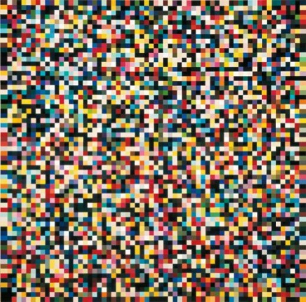
Selected work: 4096 colours.
The catalogue entry for 4096 Colours offers a direct connection with the grid discussed below. Compare the arrangement of colour units, then establish the format and publication history of the particular object. Our Richter collecting guide explains why an image and its physical edition need separate descriptions.
Explore works by Gerhard Richter
Colour as a system
Richter’s colour charts remove the expressive brushstroke and arrange coloured units within an apparently impersonal grid. Yet the system does not eliminate visual experience. Adjacencies create vibration, interruption and temporary patterns that change as the eye moves. Order and chance remain in tension: the grid promises rational structure while colour refuses to become neutral data.
Why scale and printing matter
A colour-chart work depends on precise relationships. If colour shifts, fades or is reproduced inaccurately, the structure changes. Check the stated process, date, dimensions and edition, and assess whether whites remain clean and colours balanced. Posters and publications using colour-chart imagery can be attractive historical objects, but their status and production history should be described separately from original editions.
A grid gives the eye a rule, then colour complicates it
The grid is immediately reassuring. It divides the surface into units that can be counted, compared and located. There is no obvious central figure and no conventional foreground or distance. Yet the eye rarely behaves like a counting machine. It jumps towards a bright patch, groups similar colours, finds a diagonal and then loses it. A fixed arrangement produces a moving experience.
Start with 4096 Colours as an image to examine rather than a number to admire. Look first at the distribution of light and dark. Then look for neighbouring units that seem to merge or pull apart. The title encourages an understanding of the whole as a system; sustained looking reveals how difficult it is to experience every unit with equal attention.
That difference between the system and its perception is central to the appeal of a colour-chart image. A regular framework does not remove surprise. It provides the conditions in which small differences become unusually prominent. The work can be orderly without feeling still, and impersonal in construction without producing an impersonal response.
Colour is relational rather than isolated
A coloured square does not arrive at the eye independently of its neighbours. A pale unit beside a dark one may seem particularly luminous. A warm colour next to a cool one may appear to advance. Similar colours can form temporary groups that are absent from the grid’s actual structure. These relationships make it difficult to separate the identity of a colour from the circumstances in which it is seen.
A simple looking exercise is to choose one small area and return to it after scanning the whole image. Does the same square still feel dominant? Has a neighbouring colour become more noticeable? Nothing in the object has changed, but the order of your attention has. This offers a way into the work without turning it into a test with a correct result.
It also explains why a colour chart is poorly served by a purely symbolic reading. Treating blue as calm or red as passion overlooks what those colours do in a particular arrangement. Here, their role can depend on size, spacing, saturation and adjacency. The interest lies in the relationships, not in a dictionary of emotional meanings.
What happens when the image becomes an edition
An edition gives the arrangement a particular physical form. The size of each unit, the scale of the entire image, the surrounding margin and the surface of the paper all shape the encounter. Reducing or enlarging an image changes the distance at which separate units begin to register as a larger field. A print should therefore be assessed as an object at its stated dimensions.
Begin with the complete sheet rather than a cropped image. Is the grid presented with generous margins or close to the edge? Is the border part of the printed design or a consequence of the mount? A photograph that conceals the sheet edges may be attractive but cannot answer those questions.
The precise publication matters too. A signed edition, an exhibition poster and a later authorised reproduction may use related imagery without being the same kind of object. Read the date, medium, publisher and edition information in the individual listing. The number in a colour-chart title should not be confused with the number of impressions in a print edition.
Comparing colour without expecting a screen to be exact
Two online photographs can make the same work appear different. Screen settings, ambient light, camera exposure and image processing all affect colour. Conversely, similar-looking photographs can conceal differences between physical examples. Use digital images to establish the arrangement and ask for more information when colour balance is important to a decision.
Look particularly for uneven exposure or changes that affect one part of the sheet differently from another. A mounted or framed work may need photographs that show the visible image together with the frame and surrounding margin. If the sheet has not been examined outside its frame, the description should make that limit clear rather than imply a complete inspection.
Condition should be discussed in relation to the individual object. An interruption in a flat printed colour or a mark across a regular grid can be conspicuous, but its significance depends on extent and location. Detailed photographs and a written condition description provide a better basis for comparison than an unqualified adjective such as “excellent”.
A different route into Richter
The colour charts can offer a particularly direct entry into Richter’s larger enquiry into images. They do not require the viewer to identify a sitter, locate a landscape or reconstruct a scene. Instead, they make the act of selection itself visible: what attracts the eye, what recedes and what patterns the viewer supplies.
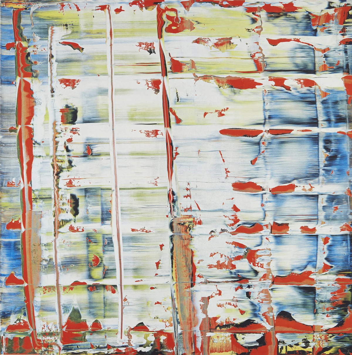
Place that experience beside the blurred image, where recognition is offered and withheld, or the abstract work, where overlapping marks suggest a history of revision. The visual languages differ, but each asks the viewer to question how an image becomes coherent.
For a collection, choose the colour-chart work whose scale and arrangement continue to hold your attention. Establish the publication and condition carefully, then give the image enough space to be seen both as an organised whole and as a field of individual events. Its apparent simplicity is a beginning for looking, rather than the end of it.
Related reading
- Collecting Gerhard Richter Prints and Editions
- Gerhard Richter’s Seascapes and the Uncertain Photograph
- Gerhard Richter’s Abstract Language
Looking for a Richter colour-chart work?
Tell us which image or format you are considering and your approximate budget. We can help compare the exact publication, dimensions, signing, colour condition and current availability.
Ask about Gerhard Richter or email the gallery. Browse the current Gerhard Richter selection.


Leave a comment
This site is protected by hCaptcha and the hCaptcha Privacy Policy and Terms of Service apply.