
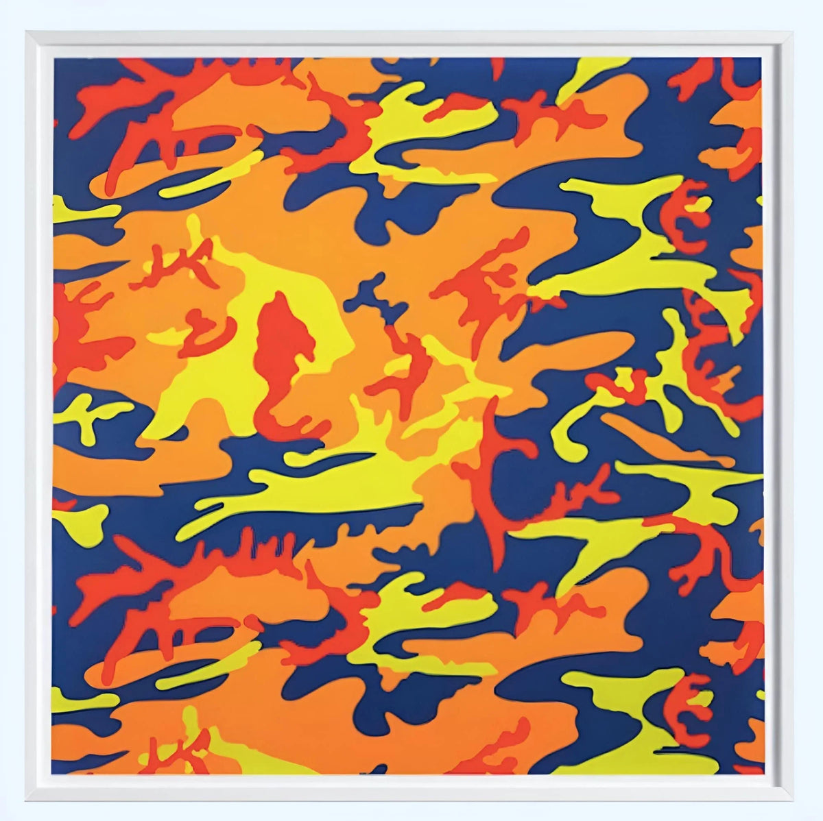
Camouflage is designed to make a surface disappear. Andy Warhol did the opposite. In his late Camouflage works, a pattern associated with concealment becomes enlarged, flattened and pushed into colour combinations that demand attention. The motif is immediately recognisable as camouflage, but its military function has been stripped away. What remains is pattern: organic shapes, repeated edges and sharply separated fields of colour.
Warhol’s 1987 Camouflage portfolio is one of the clearest print-based expressions of that reversal. It brings together eight screenprints and turns a utilitarian design into a sequence about visibility, reproduction and surface. Dovehouse Contemporary currently lists several works from the series; collectors can compare the Camouflage selection or explore the wider Andy Warhol collection. The individual examples discussed below show how the colour arrangements differ.
From concealment to display
Camouflage depends on disruption. Its irregular forms break up an outline so that a body, object or vehicle becomes harder to distinguish from its surroundings. Warhol recognised that the same visual language could become something entirely different when detached from that function. Enlarge the shapes, isolate them on a square sheet and replace naturalistic military tones with saturated or unexpected colour, and camouflage ceases to hide. It becomes an emblem.
The motif entered Warhol’s work in the mid-1980s; the Andy Warhol Museum records a Camouflage work from 1986, while the editioned portfolio followed in 1987. Museum records at the Museum of Modern Art identify the later portfolio as eight screenprints, printed by Rupert Jasen Smith in New York and published by Warhol, in an edition of 80. The group is catalogued by Feldman and Schellmann as F. & S. II.406–413.
That date places the portfolio at the very end of Warhol’s career, but the underlying logic reaches back to the beginning of his Pop practice. Warhol repeatedly took images that already circulated in the world—advertisements, publicity photographs, consumer packaging, political portraits—and altered their context through repetition and colour. Camouflage is slightly different because it is not a picture of a person or product. It is already a system of pattern. Warhol makes that system itself the subject.
Why camouflage suits screenprinting
The screenprint process is particularly well suited to camouflage. Both depend on discrete shapes and layers. Screenprinting can separate an image into areas that are printed independently, allowing colour to be substituted without changing the underlying structure. In the Camouflage portfolio, the repeated pattern becomes a framework within which Warhol can change the visual temperature dramatically.
The effect is more complex than simply “bright camouflage.” Some colour combinations feel decorative; others are acidic, dense or strangely artificial. The boundaries between forms remain clear enough for the eye to recognise the source pattern, yet the colours prevent it from performing its original purpose. The image asks to be noticed.
This is closely connected to Warhol’s broader use of commercial printing methods. His screenprints often preserve the logic of mechanical repetition while allowing colour, registration and surface to generate difference from one work to another. Dovehouse’s guide to why Andy Warhol chose screenprinting looks more closely at how that process became central to his art.
Eight prints, one visual system
The 1987 portfolio comprises eight related images rather than eight repetitions that should be treated as interchangeable. The same camouflage vocabulary runs through the suite, but changes in palette alter the balance of positive and negative space. A dark form may read as foreground in one print and recede in another. A pale colour can make the pattern feel open; a denser combination can compress it.
That matters for collectors buying an individual sheet. A single Camouflage print does not need the full portfolio around it to function, but it helps to understand that it belongs to a deliberately varied sequence. The Feldman and Schellmann reference identifies exactly which plate is being considered, while the colourway determines much of its visual personality.

Camouflage works currently represented by Dovehouse
Dovehouse Contemporary’s catalogue includes five 1987 examples from the suite: Camouflage (F. & S. II.407), Camouflage (F. & S. II.408), Camouflage (F. & S. II.409), Camouflage (F. & S. II.410) and Camouflage (F. & S. II.412). Each is catalogued as a screenprint from the edition of 80. Open the individual listing for its recorded details, and confirm the actual numbering, inscriptions, condition and current availability of the particular impression with the gallery.
Compare all five Camouflage colourways, with links to each work’s current price or enquiry route.
The II.408 listing is particularly useful for understanding the way the edition was documented: Dovehouse records the work as a screenprint in colours on Lenox Museum Board, numbered from the edition of 80 and signed on the reverse by Frederick W. Hughes, executor of the Estate of Andy Warhol. Comparable regular-edition impressions documented by Christie’s, Sotheby’s and Phillips also record executor signatures on the reverse, together with the printer’s and publisher’s markings.

What should collectors check?
Exact catalogue reference
Begin with the Feldman and Schellmann number. The complete portfolio runs from F. & S. II.406 to II.413, and the reference anchors an individual print within that sequence. It also helps distinguish a regular edition from trial proofs or other variants that can appear on the secondary market.
Edition and inscriptions
The principal portfolio was issued in an edition of 80. Because the suite was produced at the end of Warhol’s life, signing and estate documentation deserve careful attention. Auction records for regular impressions frequently describe Frederick W. Hughes signing on the reverse as executor of the Warhol Estate. Collectors should look at the exact inscription, numbering, stamps, certificate information and printer’s blindstamp on the particular work rather than assuming every example is marked identically.
Colour and surface
Colour is structural in these prints, not secondary decoration. A condition assessment should therefore pay close attention to fading, changes in colour balance, surface abrasion, scuffs and any intervention that could alter the clarity of the printed fields. The support and reverse should also be examined for mounting history, staining, handling marks and labels. When possible, compare the work with authoritative catalogue or institutional records so that the intended palette is understood before judging condition.
Provenance and documentation
As with any major Warhol edition, provenance should form a coherent chain around the physical object. Catalogue references, invoices, labels, prior auction records and certificates can all contribute. None should be treated in isolation. Dovehouse’s broader article on collecting Andy Warhol prints sets out a practical framework for considering edition, signature, provenance and condition together.
Camouflage, abstraction and Pop
The Camouflage works occupy an interesting position between abstraction and Pop imagery. At a glance they can look non-representational: fields of irregular colour without a figure, object or text. Yet the pattern is culturally loaded. Camouflage carries associations with the military, uniforms, power, fashion and anonymity. Warhol does not need to depict any of those things directly because the pattern brings them with it.
That makes the series different from a conventional abstract print. The shapes may be abstract, but the source is socially recognisable. Warhol’s intervention is to make the familiar pattern strange through scale, repetition and colour. It is the same strategy that allowed him to turn a soup label or a celebrity photograph into something both immediately legible and newly ambiguous.
The portfolio also anticipates the way camouflage would increasingly circulate through fashion and street culture as a graphic style detached from military use. Warhol’s prints do not need that later history to make sense, but it helps explain why the motif still feels visually current. A design created to suppress identity becomes a surface people choose precisely because it communicates identity.
Where Camouflage sits within late Warhol
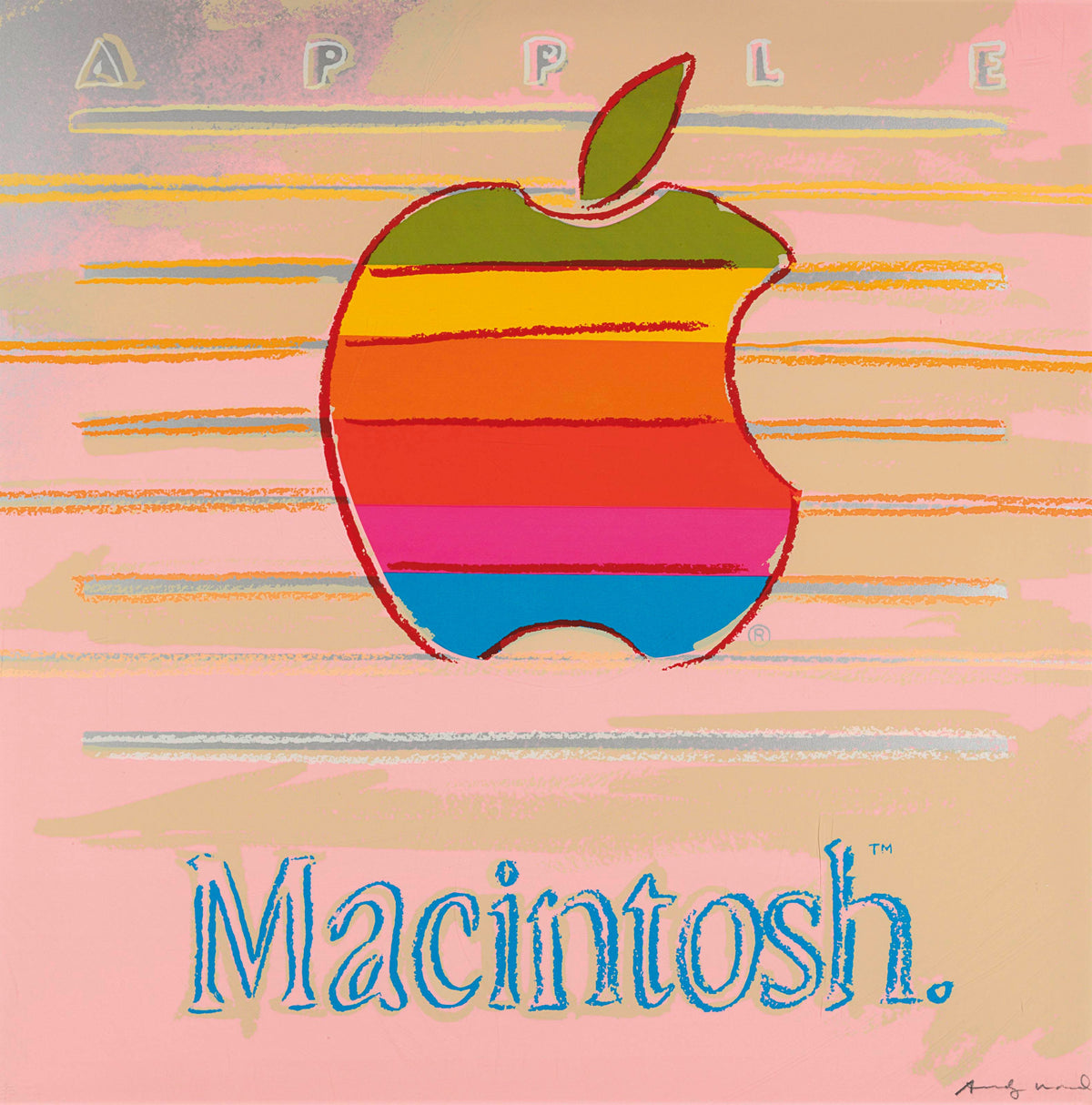
Warhol’s final years were exceptionally productive. Portraiture, religious imagery, advertising, self-portraiture and abstracted motifs all coexist. Seen alongside the 1985 Ads portfolio, Camouflage shows how readily he could move between explicit commercial symbols and a motif that operates more indirectly.
In Ads, recognition begins with a brand, campaign or celebrity. In Camouflage, recognition begins with pattern. Both bodies of work depend on the viewer knowing the visual language before Warhol interferes with it. His achievement is not to invent an unfamiliar image from nothing, but to expose how much meaning is already embedded in images we think we know.
Viewing and sourcing Andy Warhol Camouflage prints
For a collector, the strongest way to approach the series is to compare individual references rather than treating “Camouflage” as a single image. Colourway, exact F. & S. number, edition status, inscriptions, provenance and condition all matter. The five examples in Dovehouse’s catalogue, II.407, II.408, II.409, II.410 and II.412, show how strongly the character of the pattern can change across the suite.
Explore the Camouflage selection, browse all Andy Warhol works, or contact the gallery for current condition, provenance, framing and worldwide delivery information on a specific Camouflage print. We can also assist with sourcing a particular reference or colourway.

Leave a comment
This site is protected by hCaptcha and the hCaptcha Privacy Policy and Terms of Service apply.