
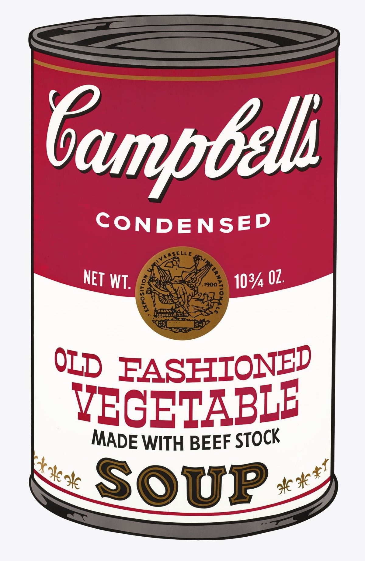
A Campbell’s Soup print by Andy Warhol can look immediately familiar and still be easy to misidentify. The shorthand description “Warhol soup can” leaves out the information that matters most to a collector: which portfolio the sheet belongs to, when it was made, its catalogue number, and how the signature and numbering appear on the reverse.
Warhol issued two related portfolios through Factory Additions in New York. Campbell’s Soup I appeared in 1968; Campbell’s Soup II followed in 1969. Each portfolio contains ten colour screenprints, each on a sheet of approximately 35 by 23 inches, in an edition of 250 with 26 artist’s proofs lettered A–Z. The visual format is deliberately consistent. That consistency is part of the work, but it is also why a title or image alone is not enough for attribution.
The quick distinction: Campbell’s Soup I versus Campbell’s Soup II
| Collector’s reference | Campbell’s Soup I | Campbell’s Soup II |
|---|---|---|
| Year | 1968 | 1969 |
| Number of prints | 10 | 10 |
| Feldman & Schellmann numbers | II.44–II.53 | II.54–II.63 |
| Regular edition | 250 | 250 |
| Artist’s proofs | 26, lettered A–Z | 26, lettered A–Z |
| Publisher | Factory Additions, New York | Factory Additions, New York |
| Printer | Salvatore Silkscreen Co., Inc., New York | Salvatore Silkscreen Co., Inc., New York |
The most efficient test is the Feldman & Schellmann number, usually abbreviated to F. & S. or F&S in catalogues. The sequence is continuous across the two portfolios. Numbers II.44 to II.53 identify Campbell’s Soup I; II.54 to II.63 identify Campbell’s Soup II. A correct catalogue number therefore answers the portfolio question even before one begins comparing flavours.
This is a more useful distinction than trying to judge by colour. Both groups use the red-and-white Campbell’s label, a silver-toned lid and a pale ground. Colour can also change through exposure, storage and photography. The catalogue number is stable. It should agree with the printed flavour, year and dimensions.
Campbell’s Soup I: the 1968 portfolio
Campbell’s Soup I translates ten different can labels into a fixed, near life-size screenprint format. Warhol had first treated Campbell’s cans in paintings earlier in the decade, but the portfolio is not simply a reproduction of one painting. Screenprinting gives every sheet the same frontal structure and makes small differences in lettering, ingredients and product names unusually prominent. Repetition does the organising; the flavour supplies the individual identity.
Cream of Mushroom is a clear example. It was made in 1968 and is catalogued as F. & S. II.53, the final number in the first portfolio. The current Dovehouse record describes a colour screenprint on paper, 35 by 23 inches, from the edition of 250, signed in pen and numbered by rubber stamp on the reverse. Those details align: title, date, portfolio and catalogue number all point in the same direction.

For a collector, II.53 is not a minor piece of catalogue notation. It distinguishes this image from every other soup label Warhol printed and anchors it within the correct set. A listing that omits the number may still be accurate, but it leaves a simple piece of due diligence unfinished.
Campbell’s Soup II: the 1969 continuation
The second portfolio keeps the same basic format and introduces ten further varieties. Its catalogue sequence begins immediately after the first set, with II.54. That first image is Old Fashioned Vegetable, made in 1969. The Dovehouse record specifies the same 35-by-23-inch sheet format, an edition of 250, and a pen signature with rubber-stamped numbering on the reverse.

Placed beside Cream of Mushroom, the work shows why visual familiarity can conceal important bibliographic differences. Both prints have the same proportions and brand architecture. Yet one closes the 1968 sequence at II.53 and the other opens the 1969 sequence at II.54. The transition is almost invisible in the image and completely clear in the catalogue.
This is also why the Roman numeral matters. “II.54” is a catalogue reference, not a statement that the impression is number 54 in the edition. The individual edition number is recorded separately on the reverse. Confusing those two systems can lead to an otherwise polished catalogue entry being wrong.
Read the reverse as carefully as the front
For both portfolios, the standard edition was signed in ballpoint pen and numbered with a rubber stamp on the reverse. The 26 artist’s proofs were lettered A–Z. A collector should therefore ask for a clear, full photograph of the verso, not only a close-up of the signature. It should show the signature, the numbering or proof letter, the sheet edges and any labels or annotations.
A reverse photograph cannot settle every question by itself. It can, however, reveal whether the claimed edition format is plausible and whether the sheet has been laid down, trimmed or heavily hinged. It also lets the catalogue description be checked against the physical object. If the front is described as a 1968 print from Campbell’s Soup I but the reference number belongs to the 1969 portfolio, stop and resolve the discrepancy before proceeding.
Our broader guide to collecting Andy Warhol prints explains why edition inscriptions should be considered alongside paper, printing and provenance. For these Soup portfolios, that joined-up reading is essential. No single detail should carry the entire attribution.
Condition: look past the strength of the red
The red label attracts the eye, so it is often the first area a buyer judges. It should not be the only one. Ask for evenly lit images of the whole sheet and close views of the metallic-looking lid, black outlines, pale background and margins. Compare the protected edges with the exposed image area for changes in paper tone. Look for creases, surface scuffs, abrasions, stains and retouching, as well as any break in the printed colour.
Screenprints have a physical surface. Raking light can disclose handling marks that a bright frontal photograph suppresses. The silver-toned area at the top of the can and the broad flat passages are especially useful places to inspect. A condition report should say what has been examined and under what conditions; a general phrase such as “good for its age” is not a substitute for description.
Framing matters too. A sheet that has spent years against acidic materials or under unsuitable glazing may show changes not apparent in a small online image. Ask whether the work has been examined out of its frame. If conservation has been undertaken, request the treatment record. These questions are routine, not adversarial.
Is an individual print complete on its own?
Yes. The portfolios were conceived as sets of ten, and complete sets have their own collecting logic, but individual sheets are also collected and catalogued independently. An individual print should be described as “from” Campbell’s Soup I or Campbell’s Soup II. It is not an incomplete object merely because the other nine flavours are elsewhere.
What changes is the question being asked. A complete set requires evidence that all ten corresponding sheets belong together and that their numbering and condition have been assessed consistently. For an individual impression, the focus is narrower: correct flavour, correct F. & S. number, edition inscription, sheet size, condition and ownership history.
A practical checklist before buying
- Confirm the precise title. Record the flavour exactly as printed and catalogued.
- Match the year to the portfolio. Campbell’s Soup I is 1968; Campbell’s Soup II is 1969.
- Verify the F. & S. number. II.44–53 belongs to the first portfolio; II.54–63 to the second.
- Check the sheet dimensions. Both portfolios use sheets of approximately 35 by 23 inches. Any material difference needs an explanation.
- Inspect the reverse. Ask for the ballpoint signature, rubber-stamped edition number or proof letter, sheet edges and labels in one clear view.
- Request a specific condition report. Pay attention to paper tone, margins, red and silver-toned passages, creasing, scuffs and previous mounting.
- Reconcile the documents. The invoice, catalogue entry, provenance and any certificate should all describe the same work.
Collectors interested in the wider history can read our account of how Campbell’s Soup entered Warhol’s practice. For the technical logic behind the crisp commercial image and repeatable format, see why Warhol chose screenprinting.
View Andy Warhol prints at Dovehouse Contemporary
The point of this distinction is not to turn a direct image into an academic puzzle. It is to make the transaction precise. Cream of Mushroom, II.53, and Old Fashioned Vegetable, II.54, sit on opposite sides of a portfolio boundary that the eye alone barely registers. Once the catalogue sequence is understood, their identities are straightforward.
Explore the current Andy Warhol collection, or contact Dovehouse Contemporary to request current availability, full condition information, verso photographs and documentation for a particular impression. Those are the materials on which a considered acquisition should be based.


Leave a comment
This site is protected by hCaptcha and the hCaptcha Privacy Policy and Terms of Service apply.