
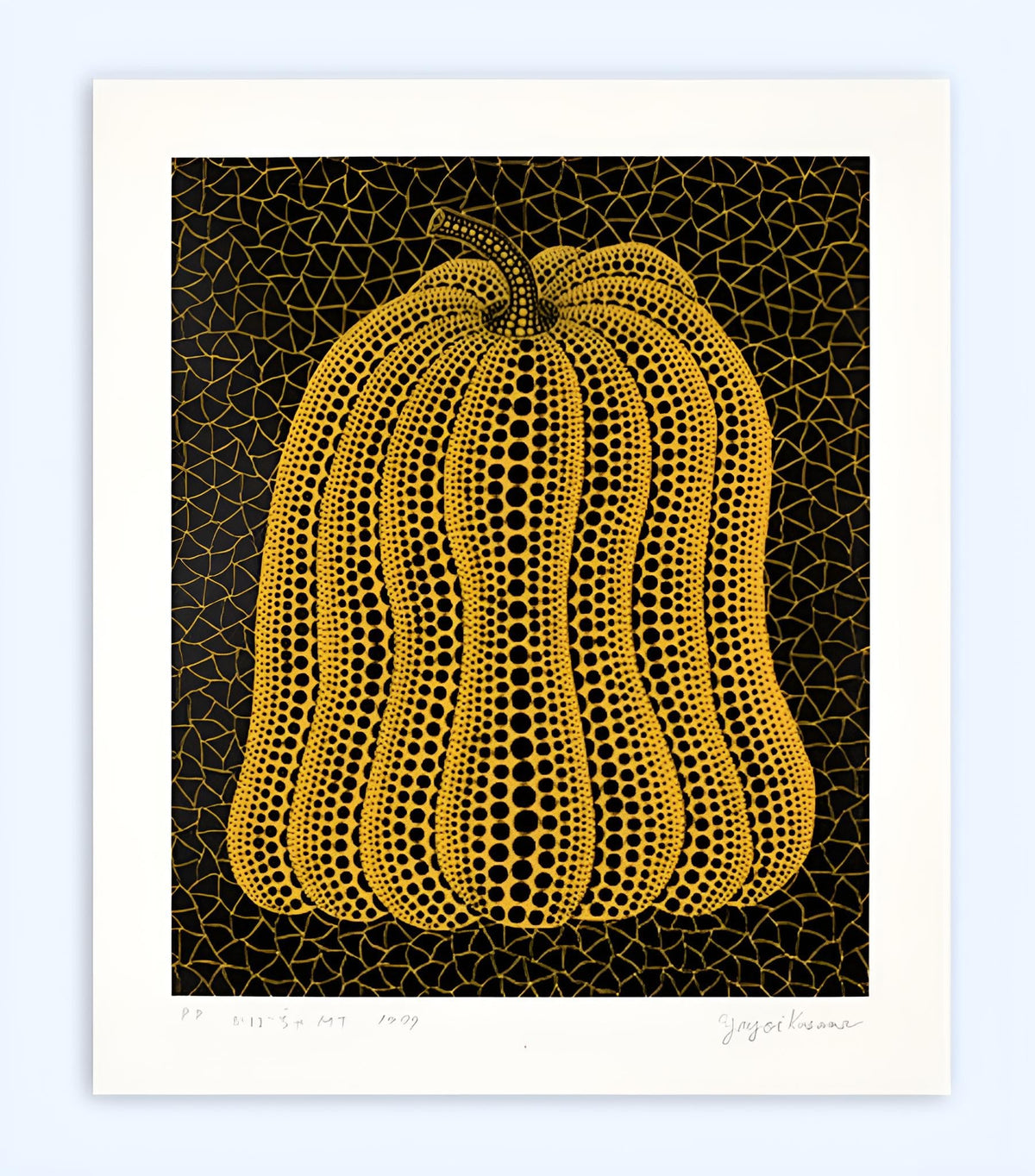
The letters “P.P.” can look deceptively simple in the margin of a print. On Yayoi Kusama’s Pumpkin MT, they identify something precise: a printer’s proof from a documented group of five, produced alongside the numbered edition of 110 and eleven artist’s proofs. That notation is not an ornamental extra. It tells us where the impression sits within the publication.
For a collector, this changes the questions worth asking. The work should not be treated as unique, nor assumed to be superior merely because fewer impressions carry the same letters. It should be understood as part of a clearly recorded edition structure. Signature, title, date, proof notation, paper, dimensions and condition need to agree.
Dovehouse currently represents a 1999 printer’s proof of Kusama’s Pumpkin MT. This guide looks closely at the image, explains what the proof designation means and compares it with the more familiar numbering of another signed screenprint, Pumpkin GB-D.
What is Yayoi Kusama’s Pumpkin MT?
Pumpkin MT is a colour screenprint on Arches paper from 1999. The current Dovehouse record gives a sheet size of 59.5 × 50.4 cm and describes the work as signed, titled, dated and annotated “P.P.” in pencil. The documented publication comprises a numbered edition of 110, eleven artist’s proofs and five printer’s proofs.
Christie’s records the same edition structure for another printer’s proof and identifies the print as Abe 257. Its catalogue gives an image size of 44.1 × 36.2 cm and a sheet size of 59.1 × 49.8 cm. Phillips records a comparable proof at 59.3 × 50 cm. Small differences of a few millimetres in catalogue measurements are common; what matters is that the particular sheet is measured, described and photographed consistently.
| Artist | Yayoi Kusama |
|---|---|
| Title | Pumpkin MT |
| Date | 1999 |
| Medium | Screenprint in colours on Arches paper |
| Dovehouse dimensions | 59.5 × 50.4 cm |
| Edition structure | 110 numbered impressions, 11 artist’s proofs and 5 printer’s proofs |
| Catalogue reference | Abe 257 |

The image: a pumpkin held inside a net
The pumpkin nearly fills the printed field. Its yellow body is built from long ribs, each one tightened by rows of black dots that change size as the surface curves. Larger dots pull the central sections forward. Smaller marks compress towards the edges and stem, making the form turn without relying on conventional shading.
Behind it, thin yellow lines form an irregular net across the black ground. This is not a passive backdrop. The mesh presses close to the pumpkin’s outline and denies the image any calm, empty space. Figure and ground are distinct, but they speak the same language of repetition. One pattern describes mass; the other creates an unstable field.
The result is both flat and bodily. Screenprint gives the colours a firm, even presence, while the shifts in dot scale produce volume. The image can be read immediately from a distance, then slows down under close inspection. That double register helps explain why Kusama’s graphic work is so effective: recognition arrives first, structure afterwards.
What does “P.P.” mean on a print?
“P.P.” normally denotes a printer’s proof. Such impressions are set aside for the printer or workshop involved in producing the edition rather than numbered within the principal run. They are part of the publication history, not an unrelated reproduction made later.
In this case, the notation is unusually clear because the groups are documented: five printer’s proofs sit outside the numbered edition of 110 and the eleven artist’s proofs. A collector can therefore place the impression within the whole edition without guessing. Our guide to artist’s proofs, printer’s proofs and hors commerce impressions explains the wider terminology.
Scarcity alone should not be turned into a quality claim. A printer’s proof is not automatically brighter, earlier or more carefully printed than every numbered impression. Modern screenprint editions are generally made to achieve consistency. The appeal lies in the documented allocation and the relationship to the production process. Any market premium should be tested against comparable sales for the same proof category, not inferred from two letters.
How to read the inscription
A full-margin photograph is essential. On the Dovehouse image, the lower margin carries the proof notation, title, date and signature. Those elements should be recorded as a group because their placement helps identify the sheet. A tight photograph of “P.P.” on its own is less useful than one showing where it sits in relation to the image and the other pencil inscriptions.
Ask for separate, high-resolution details of the signature, title, date and notation, followed by an unfiltered view of the whole recto. The verso should also be photographed. This is not because every authentic impression must carry a particular reverse mark; it is because a complete physical record makes later comparison, insurance and ownership documentation far easier.
The wording of a listing should remain exact. “One of five printer’s proofs” is informative. “Edition of five” is not: it obscures the numbered edition and artist’s-proof group that belong to the same publication. Precision prevents artificial rarity from being created through incomplete description.
Printer’s proof versus numbered impression
Kusama’s Pumpkin GB-D offers a useful comparison. The current Dovehouse example is a 2004 colour screenprint on Arches wove paper, signed and numbered 25/80. Christie’s records the publication as an edition of 80 with eight artist’s proofs and five printer’s proofs. Here the fraction “25/80” identifies the work’s position within the principal numbered edition.
Visually, the comparison is instructive too. Pumpkin MT is tall and emphatic, its yellow form pushing upwards against a black net. Pumpkin GB-D is smaller and more horizontal, with a green pumpkin occupying a broader field. Both use dots to articulate the ribs and a net-like ground to hold the form, yet their proportions create different pressures. One feels upright and monumental; the other settles lower and wider.

The comparison also shows why a pumpkin image is not enough to identify a Kusama edition. Title suffix, date, colour, proportions, sheet size, catalogue reference and inscription all matter. The broader guide to Kusama pumpkin prints and multiples covers these categories across several formats; Pumpkin MT rewards a narrower, sheet-by-sheet reading.
Condition: protect the colour and the margins
The broad lower margin is part of the object. It holds the information that distinguishes this proof, so trimming, over-mounting or adhesive damage would affect far more than presentation. Request images of all four edges and corners, not just the printed area. If framed, establish whether the sheet has been fully examined outside the frame and how it is attached to the mount.
Colour should be assessed in neutral light. The yellow-black relationship drives the entire image, and prolonged exposure can flatten that contrast. Look for uneven paper tone, fading, rippling, handling creases, surface rubbing, foxing and marks from previous hinges. None should be assumed from a catalogue photograph; they belong in a current condition report.
Archival mounting and UV-filtering glazing are sensible safeguards, but they do not make direct sunlight or unstable humidity harmless. A frame should allow the sheet to remain reversible and should not conceal the inscriptions. Our article on Yayoi Kusama in print considers how paper, colour and process change the way related editions should be assessed.
What to verify before acquiring Pumpkin MT
Begin with the complete description: 1999, colour screenprint on Arches paper, signed, titled and dated, with the “P.P.” notation belonging to the documented group of five. Confirm the measured sheet size and ask for recto, verso, margin and inscription photographs. Review the condition report, mounting method, framing history, provenance and any accompanying invoice or catalogue documentation.
Then compare like with like. A numbered Pumpkin MT is a relevant visual and edition comparator, but it is not the same category as a printer’s proof. A different Kusama pumpkin, even one of similar date and colour, should not be used as though it were the same publication.
Explore the current Yayoi Kusama collection, or contact Dovehouse about the available Pumpkin MT. We can provide the current condition information, documentation details and further photographs of the specific proof so that the inscription, sheet and presentation can be assessed together.

Leave a comment
This site is protected by hCaptcha and the hCaptcha Privacy Policy and Terms of Service apply.