
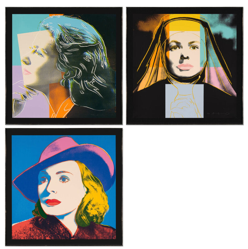
Andy Warhol’s Ingrid Bergman prints are often encountered one image at a time. That can obscure the point of the project. Conceived as a three-part portfolio in 1983, the series sets three versions of the same actor against one another: a doubled profile, a film-role portrait and a study with a broad hat. The face is constant; the presentation keeps changing.
For collectors, there is a second reason to look at the group closely. The original signed screenprints exist alongside exhibition posters and later reproductive formats that use the same imagery. They can all be visually persuasive, but they are not interchangeable. Medium, sheet size, inscriptions, printer and publisher matter.
Dovehouse Contemporary currently holds an artist’s proof set of all three Ingrid Bergman screenprints, as well as two 1983 Galerie Börjeson exhibition posters. This gives us a useful opportunity to compare the objects on their own terms.
What is in Warhol’s Ingrid Bergman portfolio?
The portfolio comprises Herself, The Nun and With Hat, catalogued as Feldman and Schellmann II.313–315. Each is a screenprint in colours on Lenox Museum Board, measuring 38 × 38 inches (96.5 × 96.5 cm). The standard edition numbered 250, with 20 artist’s proofs. Auction records from Christie’s and Sotheby’s also identify Rupert Jasen Smith as printer and Galerie Börjeson in Malmö as publisher.
The Dovehouse set is recorded as AP 8/20. Each sheet is signed in pencil and inscribed with the artist’s-proof number. That matching information is important. A complete set is not merely three related prints placed together; it should withstand a sheet-by-sheet comparison of signatures, numbering, dimensions, paper and publication marks.
The titles provide the first map. Herself is a doubled profile in which Bergman appears almost to turn through the image. The Nun faces us directly, framed by the dark geometry of a veil and habit. With Hat is the clearest star portrait: the wide brim creates a sweeping diagonal while the blue ground pushes the face forward. Seen together, the prints move between private person, performed character and manufactured image.
One face, three different kinds of attention
Warhol does not simply add bright colour to three photographs. Each composition asks the viewer to read Bergman differently.
In Herself, the overlapping heads interrupt the certainty of a single likeness. One face is pale and frontal in profile; the other is dark, almost sculptural, picked out with fine white lines. The image has movement without narrative. It feels closer to a contact sheet or a repeated publicity still than to a conventional portrait.
The Nun is unusually frontal. Its strongest forms are not the eyes or lips but the black habit and the coloured rectangles laid over the head and chest. Those blocks refuse to sit quietly behind the sitter. They cut through the photographic information, making the print feel built rather than merely reproduced.

With Hat works by a different rhythm. The face is open and pale, the hat is emphatic, and the colour boundaries sit close to the underlying photographic contours. The result is immediately legible from across a room. Up close, small shifts between outline, shadow and flat colour keep the image from becoming a simple logo.
This is why the portfolio is stronger as a sequence. Each sheet isolates one part of Warhol’s portrait method: repetition, masking, cropping, colour separation and the friction between a recognisable person and a reproducible image. No single print contains the whole argument.
Original screenprint or exhibition poster?
The distinction should be made before discussing condition or value. The original portfolio sheets are 1983 screenprints on Lenox Museum Board, signed and numbered or proof-inscribed in pencil. The Galerie Börjeson posters listed by Dovehouse are also dated 1983, but their recorded medium is offset lithograph. They measure 100 × 70 cm, with a 51 × 51 cm image, and carry the gallery’s Malmö address and the exhibition dates, 3–23 December 1983, beneath the portrait.
Those printed words are not incidental. They identify the objects as exhibition posters. The portfolio screenprints, by contrast, present the image as a square sheet without that typographic panel. A poster can be an authentic period object, closely connected to the original presentation of a body of work, while remaining categorically different from a signed screenprint in the numbered portfolio.

This distinction is especially useful online, where cropped images can make a poster and a portfolio sheet look deceptively similar. Ask for the full sheet, not only the image area. Confirm the medium in writing. Compare the dimensions with the catalogue raisonné. Check whether a signature and number are present, and whether the publisher’s or printer’s marks appear where expected. If an object includes exhibition text, make sure the listing does not silently crop it away.
How should a collector assess a complete set?
Begin with consistency. The three impressions should carry matching edition or proof designations. Signatures and inscriptions need to be examined individually; one correct sheet does not authenticate the others. The complete set recorded by Dovehouse is AP 8/20 across all three works, which is the kind of internal agreement a collector wants to see.
Next, inspect the full surface under even light. Lenox Museum Board is a substantial support, but large sheets remain vulnerable at their edges and corners. Look for scuffs in dense ink, cracking or ink loss near the sheet edge, pressure marks, handling creases and surface disturbance. Bright colour alone is not a condition report. Ask whether the work has been examined out of its frame and whether hinges, tape or mounting materials touch the sheet.
Colour comparison is most useful across the set and against reliable documentation, not against an arbitrary screen. Monitors vary, photographs are processed, and glazing changes contrast. What matters is whether the colours appear coherent with the intended printing and whether there is evidence of uneven fading or prolonged light exposure. In The Nun, for example, the pale face, pink lips, yellow and turquoise blocks and deep black habit depend on clean separation. In With Hat, the relationship between blue, magenta, yellow and red is equally structural.
Finally, ask what accompanies the set. A gallery certificate can record the seller’s assessment, but it does not replace the physical evidence of the sheets. Catalogue references, photographs of signatures and proof inscriptions, images of the reverse, condition documentation, printer or publisher marks and ownership history should be read together. Provenance is a chain of evidence, not a decorative sentence.
Is a complete set preferable to one image?
Not automatically. A single With Hat or The Nun may suit a collection with a strong focus on portraiture, film or a particular visual register. It is also a substantial work at 38 inches square. The decision should account for wall scale as well as subject.
A complete set offers something else: the portfolio’s intended comparison. Herself destabilises the face, The Nun turns costume into a hard graphic framework, and With Hat delivers the most polished star image. Displayed together, they show how Warhol could treat celebrity as a set of available appearances rather than a fixed personality.
The posters have a different appeal. Their type and exhibition details locate the images in Malmö in December 1983. They are historical graphic objects as well as exhibition-format works on paper, and they should be collected with that identity stated clearly. Dovehouse’s live examples of Ingrid The Nun and Ingrid with Hat retain the full poster design.
Where the portfolio sits in Warhol’s printmaking
The Ingrid Bergman group belongs to Warhol’s sustained examination of fame, but it is not simply a late reprise of the Marilyn images. Its three-part structure is more analytical. Instead of repeating one photographic source through many colourways, Warhol changes the pose and social role from sheet to sheet.
For a broader account of the process, read why Warhol chose screenprinting. The practical questions around signatures, edition terminology and condition are covered in our guide to collecting Andy Warhol prints. Collectors interested in how one motif changes across editions may also compare our analysis of Warhol’s Flowers prints.
Explore the full Andy Warhol collection, or contact Dovehouse Contemporary to request the condition report, detailed images and current information for the AP 8/20 complete Ingrid Bergman set. For this portfolio, the best decision begins with a simple discipline: identify exactly which object is being offered, then judge that object in full.

Leave a comment
This site is protected by hCaptcha and the hCaptcha Privacy Policy and Terms of Service apply.