
David Hockney’s pictures of France are rarely simple records of place. A Paris window becomes an argument about perspective. A photograph made for an international festival is reorganised as a poster. Decades later, the Eiffel Tower is drawn on a screen and issued as a physical edition. The technology changes, but the underlying question remains remarkably consistent: how can a familiar view be made strange enough to look at again?
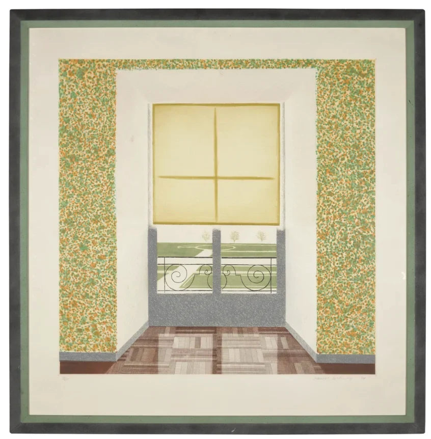
That question is particularly clear in Contrejour in the French Style, the 1974 print that anchors this guide. It is also a useful work for collectors because its subject and its manufacture are equally legible. You can see the room, the window and the formal garden beyond; then, as your eye adjusts, you begin to notice how Hockney separates those zones through line, colour and texture.
What is Contrejour in the French Style?
Contrejour in the French Style is a colour etching, soft-ground etching and aquatint made in 1974. The image was prompted by a window in the Pavillon de Flore at the Louvre, looking towards a formal garden. Hockney had already treated the subject in painting. In the print, however, he rebuilt it through intaglio processes rather than merely translating the painted image.
The title gives the first clue. “Contre-jour” describes looking towards the light, so that the illuminated view and the darker interior compete for the eye. Hockney does not resolve that competition. The lowered blind cuts across the upper part of the window, the frame divides the view, and the parquet floor leads us forward without allowing us to step through. The picture is open and obstructed at the same time.
This is not naturalistic description in the narrow sense. It is a carefully arranged demonstration of how a view is framed. The window resembles a picture within the picture, but its garden is not treated as a seamless distance. Different marks announce different surfaces: the floor, wall, blind, frame and foliage each have their own graphic character.

How Hockney turns light into printmaking
The National Gallery of Victoria records the work as colour etching, aquatint and soft-ground etching. These are not interchangeable labels. Etched lines can define the architecture and direction of the floorboards; aquatint can hold areas of tone; soft ground can carry a more immediate, drawn texture. Hockney uses their differences to prevent the room from settling into one uniform surface.
Look at the transition from the disciplined geometry of the window to the more dispersed marks on the wall. Then compare both with the garden. The exterior is visible, but it is not the only centre of attention. The wall around the window has its own optical activity, while the floor’s lines make the empty interior feel almost staged. This balance is one reason the work rewards close inspection in person. Its subject can be recognised quickly; its construction takes longer.
The print was issued in an edition of 75, with additional artist’s proofs, and published by Petersburg Press. The NGV identifies Maurice Payne, Kent Jones and Dany Levy as the printers. The example currently presented by Dovehouse is recorded as signed and dated in pencil, numbered, and bearing the artist’s copyright blindstamp. Those details matter because they describe this particular sheet, rather than relying on the general catalogue entry for the edition.
What should a collector check?
With a print of this period, begin by separating facts about the edition from facts about the individual impression. The medium, year, publisher and edition size belong to the edition. The number, signature, paper, margins, blindstamp, provenance and condition must be checked against the sheet being offered.
The image itself contains broad passages of pale paper and finely differentiated colour, so condition is not a footnote. Ask for clear images of the full sheet, not only the printed area. Review the margins, edges and reverse, and request a condition report that addresses handling creases, surface marks, staining, fading and any previous mounting. The presence of a signature or blindstamp should also be shown, not merely stated.
Scale is another practical consideration. Contrejour has the presence of a substantial picture rather than a small cabinet print. A frame should protect the paper and preserve the work’s margins without crowding the image. We would also compare the catalogue references and physical markings before deciding that two impressions are directly equivalent. Edition number alone does not answer questions of condition or presentation.
France as a way of looking
The word “French” in Hockney’s title is playful, but it is not empty decoration. The formal garden, parquet, deep window recess and controlled perspective establish a particular visual order. The Yokohama Museum of Art notes that Hockney encountered the window at the Louvre and used varied densities of line to describe its light and shade. The museum also draws attention to the dotted passages on the wall and their connection with French Impressionist and post-Impressionist ways of handling colour.
What matters is the combination of observation and artifice. Hockney found a real view, yet he emphasised everything that made it resemble a constructed picture. The frame is inside the image. Perspective is made conspicuous. The flat blind interrupts depth. Instead of pretending that the print is a transparent window, he shows us the machinery of looking.
That interest helps connect Contrejour with the artist’s later photographic and digital work. The tools become faster, but Hockney continues to test the border between immediate observation and a deliberately organised image.

Arles: when a photograph becomes a public image
Hockney’s relationship with France was not confined to Paris. In 1985 his work featured at the Rencontres Internationales de la Photographie in Arles, and he produced the festival poster. The image derives from his photographic work with the actress Theresa Russell. Its function is different from Contrejour: this was an image designed to circulate publicly and announce an event.
The Arles poster available through Dovehouse is described in the current product record as a 1985 offset lithograph on thick paper, hand-signed by Hockney. For a collector, the distinction between an exhibition poster and a numbered original print should remain explicit. A poster can still be historically specific, visually strong and desirable. Its interest lies partly in that public role.
Condition questions are correspondingly different. Exhibition posters were made to be handled and displayed, so folds, pinholes, edge wear and fading deserve close attention. A later signature may add interest, but it does not convert the object into a different printing. Clear terminology makes the work easier to compare and protects the collector from paying for a category the object does not claim.
The Eiffel Tower on an iPad
By 2010, Hockney was working with a radically different surface. The David Hockney Foundation records that he bought an iPad shortly after its April release, attracted by the larger screen compared with the iPhone. The National Gallery of Victoria catalogues Eiffel Tower by day as an iPad drawing printed on paper.
The change of tool did not remove the old problem of framing a view. The tower is instantly recognisable, but the drawing is still a decision about what to include, how to compress distance and how colour should direct attention. Digital drawing also creates a useful collecting distinction: the originating gesture occurs on a screen, while the collectable object is a physical print with its own paper, size, edition structure and markings.

The Dovehouse example of Eiffel Tower by Day is recorded as an edition of 25, signed, dated and numbered. That makes it materially distinct from the Arles poster and technically distant from the copperplate processes of Contrejour. Seen together, the three works offer a compact account of how Hockney moves between matrix, camera and screen without giving up the discipline of looking.
Three works, three collecting propositions
Contrejour in the French Style is the most complex printmaking object of the group. Its edition history, intaglio techniques and large sheet give the physical manufacture considerable weight. The Arles poster is an artefact of exhibition culture and photographic practice; its precise issue, signature and condition should be described on their own terms. Eiffel Tower by Day belongs to Hockney’s first year of iPad drawing and asks the collector to understand the relationship between a digital original and an editioned print.
None is a substitute for another. The useful comparison is not which medium is inherently superior, but how successfully each object carries Hockney’s thinking into physical form. That means looking past the subject long enough to assess paper, printing, scale, edition information and condition.
Collectors can explore the wider David Hockney collection, or continue with our guides to Hockney’s printmaking from etching to iPad, his landscapes and shifting perspective, and the physical editions made from his 2010 iPad drawings.
If you are considering Contrejour in the French Style, the Arles poster or Eiffel Tower by Day, contact Dovehouse Contemporary for current availability, supporting documentation, condition information and framing or delivery advice. The right starting point is the object itself.

Leave a comment
This site is protected by hCaptcha and the hCaptcha Privacy Policy and Terms of Service apply.