
David Hockney’s iPad drawings are often discussed as evidence of his appetite for new technology. That is true, but it can obscure the more useful point for a collector: the screen was only the beginning. A drawing made on an iPad could be sent, enlarged, printed and issued as a physical edition, and the object that resulted might differ substantially in size, paper and edition structure from another digital work made in the same year.
Hockney began using the iPad in 2010, soon after the device appeared. The David Hockney Foundation’s chronology records that its larger screen appealed to him after his earlier iPhone drawings, and that he used it during a visit to Yosemite that year. This was not a novelty detached from the rest of his practice. It gave him another way to draw directly, rapidly and in colour, then opened a new set of decisions about how that image should exist away from the illuminated screen.
What changed when Hockney began drawing on the iPad?
The most immediate change was practical. Colour, line and revision were available in one portable device, without drying time or a box of materials. Yet speed alone does not explain the images. Hockney used the tool’s particular marks rather than disguising them. Broad translucent passages sit beside wiry lines; repeated loops can describe leaves, branches or reflections; a colour may feel almost backlit even after it has been transferred to paper.
Look closely and the digital vocabulary is not uniform. Some marks resemble felt-tip drawing, others a sprayed haze or a dense scribble. The contrast can make a modest still life feel restless and a landscape feel built from accumulated notation. The tool did not impose one house style. It let Hockney move between shorthand and elaboration with unusual ease.
There is also a distinction between the image file and the editioned object. A digital image can circulate on many screens, but a signed and numbered print has stated dimensions, a specified support and a finite edition. For collecting purposes, those facts are not administrative detail. They define what is being acquired.
Why 2010 is a useful point of focus
The year 2010 catches Hockney at the moment when the larger tablet became a serious drawing instrument. His official chronology notes both the purchase of an early iPad in April and his Yosemite visit. That same year, the Paris exhibition Fleurs fraîches brought together more than two hundred recent iPhone and iPad works. In other words, the move from pocket-sized device to tablet was visible almost immediately across intimate observations and ambitious landscape subjects.
This range matters. It would be easy to assume that digital drawing naturally leads to flat, frictionless imagery. Hockney’s 2010 works do the opposite. They make the chosen mark conspicuous. A line doubles back, a translucent colour overlaps another, and the edge of a stroke remains legible. The technology disappears as a topic once the eye starts following those decisions.

Yosemite: a landscape made from marks
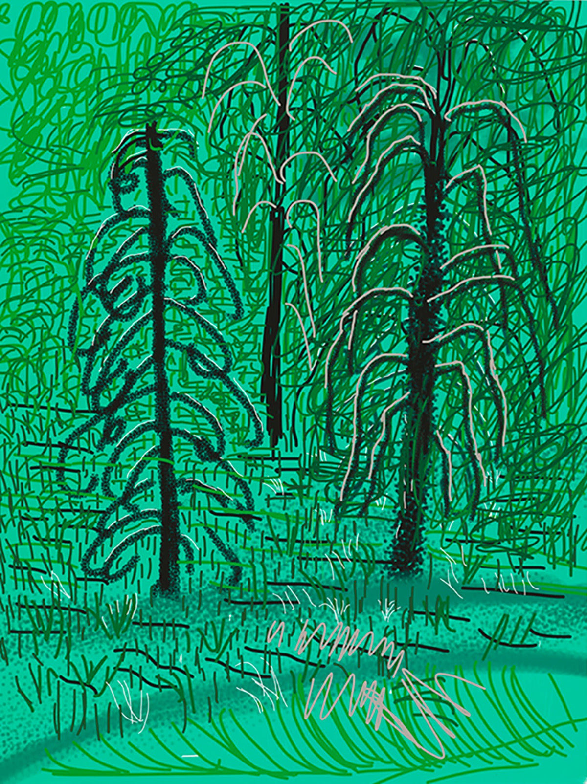
In Untitled No.16 from The Yosemite Suite, the landscape is not organised around photographic detail. The current Dovehouse image is dominated by green, with dark tree forms, pale pink contours and a mesh of looping and vertical strokes. The trees are recognisable, but the pleasure lies in seeing how differently each one is constructed. One trunk is a blunt dark column; another is surrounded by curling branches that read almost as separate signs.
Dovehouse’s live catalogue records the work as a 2010 iPad drawing printed on paper, measuring 94 by 71 cm, from an edition of 25, signed, dated and numbered. The dimensions give the drawing physical presence. This is important because a web image equalises scale: a large sheet and a smaller print occupy the same rectangle on a product grid.
The official Hockney website identifies the Yosemite Suite works as iPad drawings printed on paper, while the National Gallery of Victoria’s record for Untitled No.16 documents the same 94 by 71 cm sheet format and edition of 25. That institutional context helps separate the suite from generic “digital prints”. The originating tool, printed support, dimensions and edition all need to be read together.
The image also demonstrates why Hockney’s digital landscapes should not be reduced to smooth colour. The surface is visually busy. Fine dark loops compete with heavier forms; the acid green ground is interrupted rather than calmly filled. At normal viewing distance the scene coheres. Up close it becomes a record of individual decisions.
My Window: the same tool, a different kind of attention
ipad drawing No.281 turns inward. A red bloom sits above a patterned glass vase, framed by green shutters and an orange tabletop. The flower is not described petal by petal. It is a concentrated cloud of red, given weight by the thin white and dark lines of the vase below. The shutters supply a firm rhythm at the edges, holding together a centre that is much looser.

The catalogue entry describes an iPad drawing realised as an eight-colour inkjet print on cotton-fibre archival paper, 43 by 56 cm, from an edition of 250, signed and numbered. Those specifications place it at a very different point from the Yosemite sheet. Its edition is larger, its format more compact and its printing description more specific. Both begin with digital drawing, but they should not be treated as interchangeable examples of a single product type.
This is where a close visual comparison becomes commercially useful. No.281 suits a collector interested in Hockney’s domestic observation and the My Window group; Untitled No.16 belongs to a landscape suite and operates at a larger physical scale. Subject and wall presence pull in different directions. Neither decision can be made responsibly from edition size alone.
How does a digital drawing become a collectible edition?
The short answer is that the drawing’s digital origin does not determine the status of every later object. A collector must identify the particular publication. The same image might be encountered in a book, an exhibition catalogue, a poster or a separately issued signed edition. Those formats can all be legitimate, but they are not the same thing and should not be described or valued as though they were.
For an edition, start with the wording attached to the exact work: medium, paper, dimensions, edition number, signature and date. Then establish what is physically present on the sheet. Is the signature handwritten? Is the number part of the main edition or an artist’s proof? Does the stated size refer to the image or the complete sheet? A product title or reproduced signature should never substitute for those checks.
Digital colour also makes condition viewing important. Ask for an evenly lit image of the entire sheet, not only a cropped artwork image. Look for surface marks, handling creases, changes in paper tone and evidence of previous mounting. Request a separate photograph of the signature and numbering. If the work is framed, confirm whether the edges and reverse have been inspected.
What should collectors compare before choosing?
First, compare scale in the room. The 94 by 71 cm Yosemite sheet asks for more viewing distance than the 43 by 56 cm No.281. Add the mount and frame to those measurements before deciding where either work will hang.
Second, compare the edition information without assuming that smaller automatically means better. An edition of 25 and an edition of 250 describe different publication structures, but condition, subject, documentation and the quality of the particular impression still matter. Rarity is one factor, not a complete judgement.
Finally, compare the kind of looking each image rewards. The Yosemite work builds a dense field from repeated lines and contrasting contours. No.281 depends on the tension between a soft red flower, the transparent geometry of the vase and the rigid shutters. One expands outward into landscape; the other makes a window, table and vase feel sufficient. That difference will remain long after the novelty of the device has faded.
Seeing the printed object clearly
Hockney’s first iPad year is compelling because the technology did not narrow his attention. It moved easily from a flower on a table to the scale of Yosemite. For a collector, the central question is therefore not “Is this digital?” but “What physical edition was made from this drawing, and how well does this example represent it?”
Explore the full David Hockney collection, or contact Dovehouse Contemporary to compare current examples. We can provide further information on condition, provenance, framing and worldwide delivery for the specific work under consideration.

Leave a comment
This site is protected by hCaptcha and the hCaptcha Privacy Policy and Terms of Service apply.