
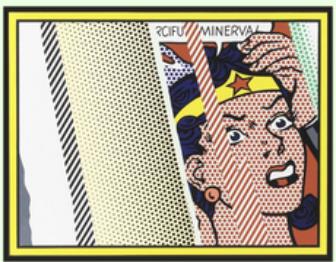
Reflections on Minerva looks immediate: a comic-book face, a clipped speech bubble, sharp black contours and a pale band that appears to flash across the surface. Yet the 1990 print is anything but simple. Roy Lichtenstein built it from lithography, screenprinting, relief, collage and embossing, making the obstruction part of the object rather than merely an image of reflected light.
That distinction matters because the title also appears on a much later offset edition. The two works share an image, but they are not interchangeable. One is a large, signed and numbered print from Lichtenstein’s Reflections series, made and published with Tyler Graphics in 1990. The other is a smaller offset lithograph dated 2013. For a collector, the useful question is not simply “Do I like the image?” It is “Which object am I looking at?”
The short answer: how do the two editions differ?
The original 1990 Reflections on Minerva is recorded as Corlett 244 and RLCR 3941. It measures approximately 107 × 131 cm and combines several print processes with metalized PVC collage and embossing on mold-made Somerset paper. The standard edition is 68. Each impression is signed, dated and numbered in pencil.
The Dovehouse catalogue also contains a 2013 Reflections on Minerva, described as an offset lithograph with a 59 × 74 cm sheet and a 51 × 65 cm image, from an edition of 800. It is a separate, later object. Its smaller scale, single stated medium and larger edition immediately distinguish it from the 1990 mixed-media print.
Collectors should therefore begin with the date, medium, dimensions and edition statement, not with the image alone. A title can recur. The specifications tell you what is actually being offered.

A reflection that refuses to stay in the background
Lichtenstein’s device is easy to recognise and harder to describe accurately. Diagonal bands cut across the woman’s face as if light were bouncing from glass. They conceal rather than clarify. The portrait remains legible, but our view is interrupted at precisely the points where we expect access to expression: eyes, mouth and speech.
That interruption gives the print its tension. Lichtenstein had spent decades turning the visual shorthand of mass printing into the subject of painting and printmaking. Here he adds another screen between the viewer and the image. The result resembles a framed picture glimpsed through glare, yet the “glare” is physically constructed within the print. It cannot be avoided by taking one step to the side.
The title identifies the figure as Minerva, but the work does not operate like a classical history painting. The name lends weight to an image delivered in the compressed language of a comic panel. Her emotional state appears urgent, while the reflection bars keep us from resolving the scene. Lichtenstein makes looking feel provisional.
Why the 1990 print is technically substantial
The official Roy Lichtenstein catalogue raisonné records a highly involved production. Tyler Graphics printed eleven colours in twelve runs, using aluminium plates, screens, a woodblock with inlaid magnesium plates, metalized PVC collage and embossing. The catalogue also notes that the lithographic passages were printed on a flatbed offset press. This is a useful reminder that the word “print” says very little by itself. What matters is how the sheet was built.
The metalized PVC is especially important to the visual logic. It gives the reflection motif a material register different from the printed face beneath it. Relief and embossing add further physical variation. From a distance, the composition reads with Lichtenstein’s familiar graphic force. At close range, it becomes a layered surface whose manufacture is plainly part of its meaning.
The standard edition comprised 68 impressions, with additional proofs separately recorded by the catalogue raisonné. The sheet dimensions are 106.7 × 131.4 cm, while the printed image is smaller within it. Tyler Graphics was both printer and publisher. Those details are not decorative scholarship; together they establish the identity of the edition.
For the Dovehouse example, the current catalogue record states that it is signed, dated and numbered in pencil and cites both Corlett 244 and RLCR 3941. A buyer should still ask to see the precise edition number, the signature area, the Tyler Graphics blind stamp and the workshop notation on the verso. The catalogue raisonné records those features for the edition, but each individual impression should be checked on its own evidence.
The 2013 offset is a different collecting proposition
The later offset should be judged on its own terms. It offers the composition at a smaller scale and at a different level of access. It does not acquire the production history of the 1990 work merely because the image is the same. Nor should it be described with the original print’s catalogue numbers, mixed-media specification or edition size.
This is the point at which online listings often become confused. Search results place matching images side by side, while dates and media disappear below the fold. A buyer may see Reflections on Minerva and assume that every listing refers to Corlett 244. It does not.

For the 2013 version, the relevant facts are those stated on its own record: offset lithograph, paper size 59 × 74 cm, image size 51 × 65 cm and edition of 800. Before purchase, ask what numbering or publisher information appears on the sheet, whether any signature is printed or applied by hand, and what supporting documentation accompanies it. Do not transfer assumptions from the 1990 edition.
Our guide to Roy Lichtenstein original prints and exhibition posters sets out the broader hierarchy of evidence. The same discipline applies here, even though this later catalogue record is described as an offset lithograph rather than an exhibition poster.
What condition points matter?
With the 1990 print, condition assessment needs to account for more than paper. Ask for clear images of the full sheet, margins, corners, signature and numbering, along with raking-light views that show relief and embossing. The metalized PVC collage should be examined for lifting, abrasion, scratches or changes in adhesion. Any hinge or mounting arrangement should avoid unnecessary stress on a large, technically varied sheet.
Colour should be considered against reliable reference images, but photographs are not a substitute for a condition report. Lighting and screen settings can alter the appearance of the blues, greens and metallic passages. The paper should also be reviewed for handling creases, surface dirt, discolouration and previous mounting evidence. None of these observations should be assumed from a front-facing image.
The 2013 offset has a simpler material structure, but the familiar checks still apply: the edges, corners, surface, colour, margins and any verso inscriptions. If framed, ask whether the work has been examined out of the frame and what glazing and backing materials were used. Our general article on condition and framing for contemporary prints explains why the frame can protect a work while also concealing information a buyer needs.
How the work fits within Lichtenstein’s printmaking
Reflections on Minerva rewards collectors who already understand Lichtenstein’s dots and outlines, because it shows him putting pressure on that established language. The woman is not simply a reprise of a 1960s comic heroine. She is partly overwritten by an abstract system that behaves like light, glass and graphic interruption at once.
The work belongs naturally beside the broader discussion of Lichtenstein’s Ben-Day dots, but should not be reduced to dot technique. The 1990 print is as much about layering, obstruction and the physical intelligence of the workshop. It also makes a strong bridge between Lichtenstein’s Pop vocabulary and the technically ambitious prints of his later career.
For a wider view of editions, signatures, catalogue references and workshop information, see our guide to collecting Roy Lichtenstein prints. Collectors can also browse the current Roy Lichtenstein collection to compare the work with other prints and offset editions.
Which version is right for a collection?
The answer depends on what the collection is trying to achieve. The 1990 edition is the significant printmaking object: large, signed and numbered, documented in the catalogue raisonné and made through a complex collaboration with Tyler Graphics. Its scale and layered surface demand space and careful handling.
The 2013 offset is smaller, more straightforward and priced as a different category of object. It gives access to the image without pretending to be the 1990 edition. That clarity is a strength, provided the listing is read precisely.
We advise comparing the two specification by specification before making any decision. If you are considering either work, contact Dovehouse Contemporary for current availability, a condition report, additional photographs and advice on framing or international delivery. For the 1990 impression in particular, ask for the exact edition number and full documentation. The image may be familiar. The object should never be assumed.


Leave a comment
This site is protected by hCaptcha and the hCaptcha Privacy Policy and Terms of Service apply.