
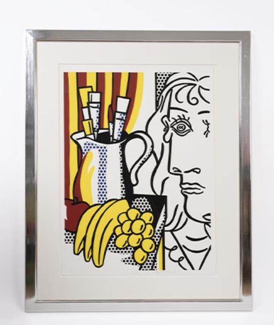
Roy Lichtenstein’s Still Life with Picasso is a picture about influence that never becomes dutiful. A jug of brushes, a striped backdrop and a bowl of fruit occupy the left half of the sheet. On the right, a fractured face announces Picasso. The quotation is unmistakable, yet every part has been translated into Lichtenstein’s own clipped outlines, flat colour and printed dots.
Made in 1973 for the international Hommage à Picasso project, the screenprint sits at a useful junction in Lichtenstein’s work. It looks back to Cubism while refusing to imitate its surfaces. It also turns the traditional still life into a concise lesson in how one artist can absorb another without disappearing behind him.
What is Still Life with Picasso?
The short answer is precise. Still Life with Picasso is a 1973 screenprint on Arches 88 paper, catalogued as Corlett 127 and RLCR 2212. It was printed by Gemini G.E.L. in Los Angeles and published by Propyläen Verlag, Berlin, and Panthéon Presse, Rome, for the Hommage à Picasso portfolio. The standard edition was 90, with several categories of proofs recorded separately.
The current Dovehouse catalogue entry describes the available impression as an edition of 90, signed and dated in pencil. It is offered on a price-on-application basis. Those facts make it a different proposition from a poster or a later reproduction: this is the original editioned screenprint documented in Lichtenstein’s print catalogue.
The project itself was substantial. The Roy Lichtenstein Catalogue Raisonné records six volumes made in honour of Picasso, containing work by 69 artists. Lichtenstein’s print appeared in volume four. The first half of the numbered edition was allocated to Propyläen Verlag and the second to Panthéon Presse. That publication history matters because it explains why the work belongs simultaneously to Lichtenstein’s own printmaking and to a larger, carefully organised tribute.

Picasso is the subject, not the style
Lichtenstein does not attempt a Cubist pastiche. He separates Picasso’s visual language into recognisable signs, then places those signs inside his own system. The face is shown frontally and in profile at once, but its contours are clean and emphatic. The fruit is reduced to yellow shapes edged in black. Blue and black dots give the jug and table a printed texture, while the red-and-yellow stripes behind the brushes are closer to commercial graphics than to an early twentieth-century studio interior.
The result is affectionate and analytical. Picasso is present as a repertoire of devices: the displaced eye, doubled viewpoint, curling line and compressed figure. Lichtenstein is present in the discipline that holds them together. Nothing appears accidental. Even the exuberant stripes are stopped by the hard white ground around the Cubist head.
This is why the image works better than a simple quotation. It stages two ways of making a picture. Picasso broke a subject into shifting viewpoints; Lichtenstein turns that breakage into the stable, reproducible vocabulary of screenprint. The composition is busy, but the logic is clear from across a room.
Why the screenprint process matters
The catalogue raisonné records four colours printed in four runs from four screens: yellow, red, blue and black. That economy is part of the work’s intelligence. Lichtenstein obtains several kinds of surface from a very limited palette. Solid yellow carries the fruit and reflections on the jug. Red builds the stripes and a darker mass at lower left. Blue appears mainly as dots. Black supplies contour, shadow and the visual authority of the Picasso head.
Screenprinting allows each colour to arrive as a distinct layer. The dots do not pretend to be painterly shading; they declare themselves as a pattern. The black line does not describe gradual modelling. It divides, contains and redirects the eye. In a work concerned with another artist’s style, the process prevents quotation from becoming imitation.
Gemini G.E.L. printed the edition, with Kenneth Tyler involved in collaboration and proofing and Jeff Wasserman in edition printing. For a collector, this workshop information is more than background. It identifies the production context and provides marks that can be checked against the sheet. The catalogue entry records a Gemini blind stamp at lower right and a workshop number on the verso, alongside the artist’s signature, date and numbering.

Edition, dimensions and the questions worth asking
The standard edition consisted of 90 impressions. The catalogue raisonné also lists 30 artist’s proofs, 30 trial proofs, 15 épreuves d’artiste and a small number of other proof designations. This is a good example of why “edition of 90” does not describe every impression that may legitimately exist. The notation on the sheet must be read, not inferred.
The current Dovehouse record gives the dimensions as 75.8 × 55.6 cm. The catalogue raisonné records the standard sheet at 76.2 × 56 cm and the image at 72.2 × 53.2 cm. The difference is small, but it should not be waved away. Measurements can vary with rounding or with what has been measured. Ask for confirmation of the full sheet dimensions outside the frame and compare the margins with the published specification.
The product record states that the impression is signed and dated in pencil. Before purchase, we would also ask for close photographs of the lower margin, the Gemini blind stamp and the verso workshop notation. The catalogue describes the edition’s usual inscriptions; an individual impression should be assessed on its own visible evidence. The same principle applies to provenance and condition. A catalogue match identifies the work, not the history of a particular sheet.
How should condition be assessed?
Begin with the whole sheet. Check the edges, corners and margins for trimming, handling creases, tears or old hinges. Examine the white paper for discolouration and compare areas that may have been covered by a mount. Strong colour is important here because the red, yellow and blue are structural, not incidental accents.
Request photographs under even light and, if the work is framed, ask whether it has been examined out of the frame. Glazing can disguise undulation, surface marks and changes in the paper. The aluminium-coloured frame seen in the current catalogue photography may suit the graphic character of the image, but it should not substitute for information about the sheet beneath it.
A written condition report should distinguish between observations and assumptions. “No visible damage while framed” is not the same as an examination of the front, reverse and margins. If conservation has been carried out, ask what was done and when. None of these questions diminish the work; they establish the terms on which it can be compared with another impression.
Where it sits within Lichtenstein’s art-historical images
Still Life with Picasso belongs to a broader strand of Lichtenstein’s practice in which other artists and established genres become raw material. Collectors who respond to that aspect of the work can compare it with Cubist Cello, where an instrument is pushed through a similarly art-historical filter, and Artist’s Studio, Look Mickey, an image that places Lichtenstein’s own earlier motifs inside a studio setting.
Those connections help distinguish the present work from the comic-derived women and war pictures for which Lichtenstein is best known. The familiar black line and dots remain, but the central question has changed. Instead of asking how a mass-media image behaves when enlarged, the print asks what happens when modern art itself becomes the source image.
For the wider technical context, our essay on Lichtenstein and the Ben-Day dot explains how a mechanical mark became a flexible pictorial tool. The guide to collecting Roy Lichtenstein prints covers catalogue references, condition and documentation, while original prints versus exhibition posters clarifies distinctions that are especially useful when a famous image appears in several formats.
Is Still Life with Picasso a strong collecting choice?
It is strongest for a collection interested in dialogue: Pop and Cubism, old genre and new process, quotation and authorship. The image is immediately legible, but the reason to live with it lies in the differences between its parts. Dots, stripes, fruit, brushes and the split face never quite merge into one stylistic voice. That friction is the point.
The edition is also well documented. The Roy Lichtenstein Catalogue Raisonné and the National Gallery of Art both record the work, medium, printer and catalogue number. That gives a buyer a firm reference against which to test the offered impression. It does not remove the need for individual due diligence.
Browse the current Roy Lichtenstein collection to compare subjects, processes and scale. If Still Life with Picasso fits your collection, contact Dovehouse Contemporary for current availability, an unframed condition report, detailed photographs of the inscriptions and verso, and advice on delivery. The important decision is not simply whether the image is familiar. It is whether this particular impression has the condition and documentation the work deserves.
Reference: Roy Lichtenstein Catalogue Raisonné, RLCR 2212; National Gallery of Art, Still Life with Picasso.

Leave a comment
This site is protected by hCaptcha and the hCaptcha Privacy Policy and Terms of Service apply.