
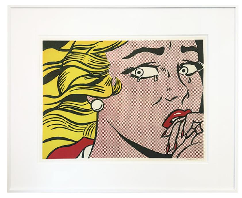
Roy Lichtenstein’s Crying Girl is immediately recognisable. The physical object is less straightforward. It is often described loosely as a “signed Pop Art print”, yet the details that matter to a collector are more precise: it was made in 1963 as an offset lithograph and as an announcement for Lichtenstein’s second solo exhibition at Leo Castelli Gallery in New York. It was not issued as a numbered edition.
That history explains why two authentic impressions can look different on the reverse, why some have fold lines and others do not, and why a missing edition number is not automatically a defect. It also makes sheet size, margins, colour and the verso unusually important. The familiar face is only the beginning of the identification process.
What is Roy Lichtenstein’s Crying Girl?
Crying Girl is a colour offset lithograph on lightweight, off-white wove paper. The Roy Lichtenstein catalogue raisonné records it as RLCR 759 and Corlett II.1, published by Leo Castelli Gallery and printed by Colorcraft in New York. The image was printed in three colour runs: yellow, red and black.
The work announced Lichtenstein’s exhibition at Castelli, held from 28 September to 24 October 1963. Part of the press run carried the gallery’s return address and exhibition details on the reverse, was folded into quarters and mailed. Other impressions had no printing on the back; many of those were signed in pencil and sold or given away through the gallery. The catalogue records the overall edition as unknown.

Why the mailer and non-mailer versions matter
A collector should not begin with the signature. Begin with the object’s publication history. A mailed example may have Castelli’s address and the exhibition dates on the verso, together with the quarter folds created for posting. Those folds are consistent with its original function, although their visibility, any associated splitting and the quality of later conservation still affect condition.
An impression without verso printing belongs to the other documented part of the run. These examples were not folded for mailing and are often, though not invariably, signed. The catalogue raisonné says that many impressions carry Lichtenstein’s pencil signature at the lower right. “Many” is not “all”. An unsigned impression therefore needs to be assessed by its paper, printing, dimensions, history and comparison with documented examples rather than rejected or accepted on one feature alone.
Conversely, a pencil signature does not settle every question. It should be examined in relation to the sheet, not treated as a substitute for it. Clear photographs of the recto, verso, margins and signature area are basic due diligence. Our guide to authenticating a Roy Lichtenstein print sets out the broader evidence that should agree before attribution is considered secure.
Dimensions: measure the sheet, image and margins
The catalogue raisonné gives the standard sheet as 45.8 × 61 cm and the image as 43.8 × 59 cm. The National Gallery of Art records virtually the same measurements for its impression. The documented mailer format is slightly smaller, at 43.2 × 58.2 cm, because that portion of the run was trimmed.
The current Dovehouse listing records 44 × 60 cm. That may reflect an approximate or visible measurement, so it should not be interpreted in isolation. Before acquisition, ask which edges were measured, whether the work is framed, how much of the margin is visible and what appears on the reverse. A difference of a centimetre can be a matter of measuring convention; a substantially altered sheet is a different issue. Exact dimensions are most useful when paired with full, unframed photographs.
This is a good example of why catalogue references such as RLCR 759 and Corlett II.1 are valuable but not self-executing. They define the documented work. They do not prove that every sheet offered under that title conforms to it.
Unnumbered does not mean incomplete
Collectors accustomed to edition fractions may expect a number such as 24/100. Crying Girl was not published that way. Its edition size is unknown and the absence of a fraction is correct for the work. Adding a handwritten number would not make an impression more complete; it would raise a new question about when and why the number was applied.
The better description is direct: an unnumbered 1963 offset lithograph and Castelli Gallery announcement, with the particular impression’s signing status, verso and folds stated separately. That wording preserves the difference between publication structure and the history of an individual sheet.

Do not confuse a lifetime announcement with a later publication
Offset lithography describes a printing process, not a single category of value or authorship. Dovehouse also has a 2007 offset lithograph titled Seductive Girl, recorded with a sheet of 68 × 86 cm and an edition of 2,000. It is a different publication, made after Lichtenstein’s death, and should be collected on those terms.
Crying Girl, by contrast, belongs to 1963 and to the Castelli exhibition for which it was produced. The lesson is not that one offset is legitimate and another is not. It is that date, publisher, purpose and edition structure define the object. A familiar Lichtenstein image can circulate through an artist-designed print, an exhibition announcement, a later authorised publication or a poster. Precise descriptions allow each to be judged fairly. Our guide to Lichtenstein original prints and exhibition posters explains those distinctions in more detail.
Condition points that deserve close attention
The work depends on a narrow palette and very clean graphic relationships. Yellow hair, red dots and lips, dense black contours and the tone of the paper all carry information. Colour loss can flatten that balance. Ask for images made in neutral light and compare the sheet with institutional examples, while allowing for differences in photography and screens.
On the paper itself, look for overall discolouration, local staining, handling creases, edge tears and losses. Examine the corners and the area around the signature. With a mailer, establish which folds are original to posting and whether they have weakened or split. With any impression, check for trimming against the documented formats and for adhesive, tape, backing or hinge residues on the reverse.
A frame can conceal exactly the evidence needed to understand the sheet. Request unframed photographs where possible and ask whether the paper is laid down. A useful condition report distinguishes an original fold from later damage and records conservation without either minimising it or turning wear into a romantic story.
A practical checklist before buying
- Confirm the title, date and references: Crying Girl, 1963, RLCR 759 and Corlett II.1.
- Record the medium as offset lithograph on lightweight, off-white wove paper.
- Measure the full sheet and the printed image, not only the visible area inside a mount.
- Photograph the entire verso and note Castelli text, folds, labels, hinges or other inscriptions.
- Describe the signature precisely, including its medium and position.
- State that the work was not numbered and that the edition size is unknown.
- Review colour, trimming, paper tone, creases, tears, repairs and mounting.
- Retain the invoice, condition report and provenance documents with the work.
These questions are ordinary, which is why they are effective. A celebrated image can encourage a buyer to stop at recognition. Collecting begins when recognition is followed by measurement, comparison and documentation.
Where Crying Girl sits in Lichtenstein’s work
The image concentrates many of the tensions that make Lichtenstein’s romance subjects endure. A tear signals private feeling, but the face is built from impersonal dots, flat colour and emphatic contour. The close crop brings the viewer near while withholding the event that caused the distress. Our essay on Lichtenstein’s romance images considers that emotional distance across the wider group.
For a collector, the same tension exists in the object’s history. Crying Girl looks like a self-contained Pop image, yet its folds, verso and publisher connect it to a specific New York exhibition and to the practical circulation of art in 1963. Those details do not sit behind the image. They are part of what the work is.
Explore the current Roy Lichtenstein collection, or contact Dovehouse Contemporary to request availability, an unframed condition report, high-resolution recto and verso images, and further details for the 1963 Crying Girl.

Leave a comment
This site is protected by hCaptcha and the hCaptcha Privacy Policy and Terms of Service apply.