
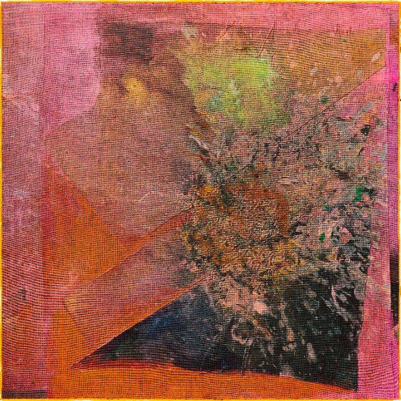
Frank Bowling’s art resists a neat division between formal abstraction and lived experience. Colour may dominate first, but geography, memory and biography remain embedded in the work. Born in British Guiana and based between London and New York, Bowling developed a practice in which maps, poured paint, staining and accumulated material could operate within the same expansive field.
His celebrated Map paintings of the late 1960s and early 1970s introduced stencilled outlines of continents into luminous expanses of colour. These were not conventional maps, nor simple statements of identity. Geography became an unstable image: repeated, mirrored, partly submerged and transformed through paint. Bowling’s subsequent poured works pushed further into material experiment, allowing gravity, chance and process to shape the surface.
What happens when a Bowling becomes an edition?
An edition cannot reproduce the physical accumulation of one of Bowling’s large canvases, and the best examples do not pretend to. Instead, they translate particular qualities—colour relationships, cartographic structure, atmosphere or movement—into a different medium and scale.
Doughlah G.E.P, dated 1971/2023, returns to an image from the Map-painting period through a giclée print on Somerset Velvet cotton rag paper. The embossed publisher’s stamp is part of the work’s recorded specification, and the stated edition information helps identify the particular publication being offered.
Rupununi, also 1971/2023, extends across a wider horizontal format. Its title refers to the region in Guyana, allowing landscape and memory to enter the image without turning it into a literal view. The generous 72 × 100 cm sheet preserves a sense of breadth central to Bowling’s work.
The smaller Australia to Africa and Texas Louise use giclée with screenprinted gloss detail on Somerset paper. Both are stamp signed on the reverse. Their elongated format makes them feel almost panoramic, while the gloss element introduces a changing surface that responds to light.
Later colour
Other editions move away from cartographic imagery while retaining Bowling’s sensitivity to chromatic atmosphere. Penumbral Lite, 2020, is built around the suggestion of partial shadow—the “penumbra” between light and darkness. The print’s colour feels suspended rather than fixed, an effect that recalls Bowling’s sustained exploration of how a painted field can appear spatial without describing a recognisable place.
The compact cotton editions Madambutterfly, Wadi Two, Roar and After Matisse each measure 33 × 33 cm. Their shared dimensions encourage close comparison: the format remains constant while colour, title and visual rhythm change.
Collecting Frank Bowling prints
For collectors, the distinction between a signed print, a stamp-signed edition, an embossed publisher’s stamp and an unsigned reproduction is essential. The date can also carry two moments: the date of the source image and the date the edition was produced. Neither should be omitted, because each explains a different part of the work’s history.
View the available Frank Bowling works, or contact Dovehouse Contemporary for condition reports, edition details and help comparing works across the current selection.
Read geography as a changing presence
A map normally promises stable information about the world. In Bowling's imagery, geographic shapes can become partial, submerged or difficult to separate from surrounding colour. The viewer may recognise a continent and then lose it again within the field. Geography remains present without functioning as a diagram that fixes the image's meaning.
This makes the work's relationship to memory more complex than an illustrated journey. A place can be recalled through fragments, colour and the persistence of an outline rather than described as a complete scene. The image allows recognition and uncertainty to occupy the same surface. Its historical associations do not cancel the immediate work performed by colour.
Two dates tell two parts of a publication's story
A description such as 1971/2023 should be read carefully: the dates can distinguish the source image from the later edition. They should not be collapsed into a claim that the paper object itself was printed in the earlier year. Ask how the publisher describes the relationship and retain that explanation with the work's records.
The Doughlah G.E.P entry gives the current catalogue specification, including its support and publisher's embossing. A publisher's stamp is not automatically a hand-signature by the artist. The signing method, publication date and edition information each answer a different question, and a complete description keeps them separate.
Surface changes the encounter with colour
A paper edition can translate a painted image while creating its own relationship between ink, support and light. A gloss detail may become more or less visible as the viewer moves. A matte field can hold colour differently. These effects are part of the object and should be assessed through suitable photographs or direct viewing, not assumed from the source painting.
Compare the complete dimensions as well. A broad horizontal sheet establishes a different bodily relationship from a compact square. Both may sustain an expansive colour experience, but they do so through different proportions and viewing distances. The shared artist gives the comparison coherence; the physical differences give it substance.
Continue with the digital print guide and the Frank Bowling collection. The most useful reading joins colour, publication and personal response without making any one of them stand in for the others.
Keep photographs of the complete sheet with the publication record, including any embossing or reverse marks. Those details may be less accessible once the work is framed.
Related reading
- How Condition and Framing Affect a Contemporary Print
- Pigment Print, Giclée and Digital Print: A Collector’s Guide
- Lithograph vs Screenprint: How the Two Printmaking Methods Differ
Colour carries structure and history
Bowling’s colour is expansive but not purely formal. Fields, stains and shifting edges can hold references to geography, migration and memory without turning into literal maps. In print, layering and transparency translate that complexity into a different surface, allowing colour relationships to remain active at a more intimate scale.
Assessing an edition
Identify technique, paper, dimensions, edition, signature, printer and publisher. Look closely at the depth and balance of colour, embossing or surface variation, registration and margins. Related paintings and prints should be connected through ideas rather than assumed to be reproductions of one another. Provenance and condition help distinguish the quality of individual impressions.

Leave a comment
This site is protected by hCaptcha and the hCaptcha Privacy Policy and Terms of Service apply.