
How printmaking concentrates Kusama’s motifs.
Screenprint and editioned media suit an art built through repetition, edge, colour and serial variation.

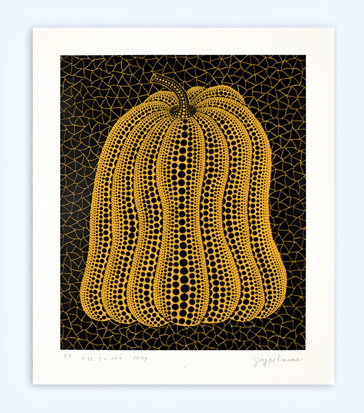
Selected work: Pumpkin MT.
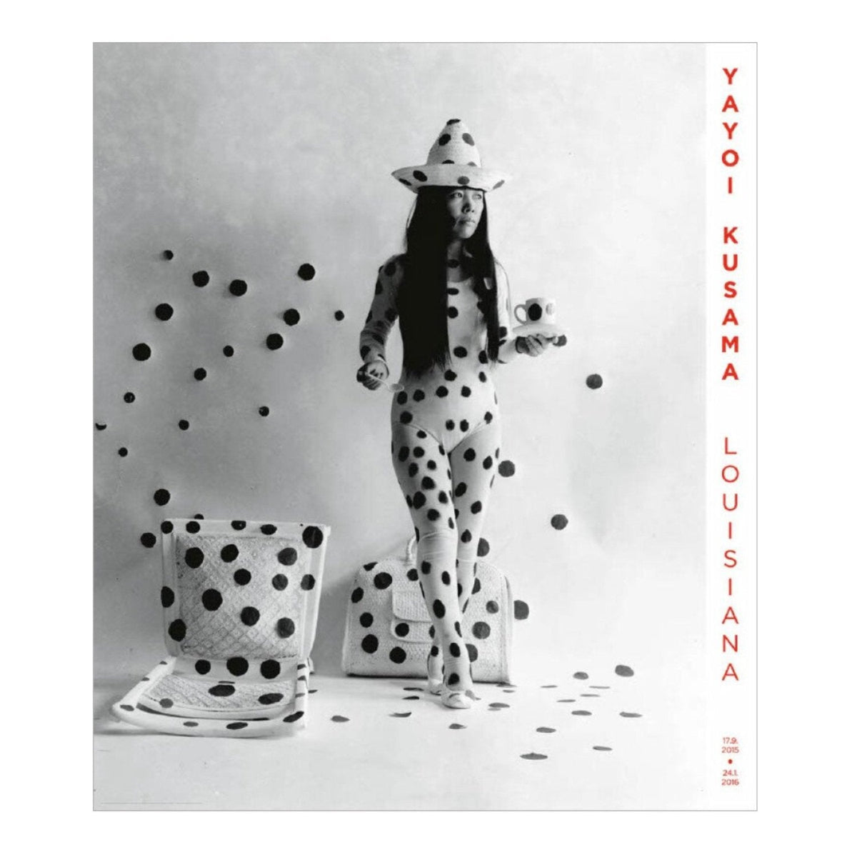
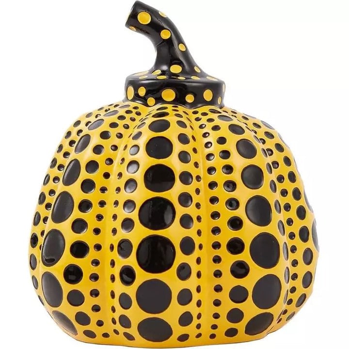
Current examples include Pumpkin Cast Resin Figure - Red, Yellow, Pumpkin Cast Resin Figure - Naoshima. Red (2019) and My Self Portrait done when I was heartbroken. View the complete Yayoi Kusama collection for current availability.
Explore available works by Yayoi Kusama
Pattern becomes structure
Kusama’s dots and repeated marks do not merely decorate a subject. They can dissolve the boundary between figure and ground, make a pumpkin pulse with visual rhythm or turn the sheet into part of an apparently continuous field. Print processes give those repetitions exceptional clarity while preserving small variations of density, scale and colour.
Comparing Kusama editions
Check the exact title, year, technique, sheet size, edition, signature and publisher. Similar motifs recur across decades and media, so the image of a pumpkin or net is not enough to identify a work. Colour should be assessed carefully, as fading or an inaccurate photograph can materially change the balance; margins, paper surface and provenance also distinguish a strong impression.
The sheet gives repetition a boundary
A print is a finite object, even when the pattern within it seems capable of continuing indefinitely. That tension is one of the most useful ways to approach Kusama on paper. The eye follows a repeated sequence towards the edge and imagines it continuing, while the sheet insists on a particular size and shape. The physical boundary is therefore part of the experience rather than simply a convenient place to stop the image.
Notice whether a composition leaves an unprinted margin or carries colour close to the edge. A margin can make the pattern appear contained and available for inspection. A more closely cropped field may feel as though it is only a portion of something larger. These are different visual propositions. They should be understood before choosing a mount that might conceal the work's original relationship between image and paper.
Screenprint and offset are different descriptions
The gallery's Pumpkin MT is recorded as a 1999 colour screenprint on Arches paper. By contrast, My Self-Portrait Done When I Was Heartbroken is catalogued as a 2010 offset lithograph with gallery text on the reverse. The distinction is useful because a shared artist and a recognisable pattern do not establish an identical production history or edition status.
Screenprinting pushes ink through the open areas of a stencil held on mesh. Offset lithography transfers an image through an intermediate surface before it reaches the paper. Either description needs to be read alongside the purpose and circumstances of the publication. Technique alone cannot determine whether an object is a signed limited edition, an exhibition poster or another authorised publication. The catalogue should tell you which category applies to the actual sheet.
Dots can describe volume or flatten it
On a pumpkin, the changing size and arrangement of dots can reinforce the swelling of the form. They can also pull attention back to the flat surface on which that volume is represented. Look at a row of marks as it approaches the side of the image. Does it appear to turn away, compress or simply stop? The answer helps explain how a patterned surface can remain both graphic and sculptural.
Elsewhere, repeated marks may cover the ground as densely as the central motif. Figure and background then compete for attention, and the usual separation between an object and its setting becomes uncertain. This optical tension is more specific than a general claim that the work is colourful or decorative. It gives the viewer a way to describe what the pattern is actually doing.
Read colour as a relationship
A bright hue does not operate alone. Its apparent intensity depends on the colour beside it, the amount of space it occupies and the density of the surrounding marks. The same yellow can feel expansive against one ground and tightly contained against another. A small change in contrast can make dots stand forward as individual units or merge into a more continuous field.
For this reason, condition matters to the structure of the work. Uneven fading can alter the balance between adjacent colours even when the subject remains recognisable. Ask for photographs taken in consistent, neutral light and a report that describes any colour change or surface disturbance. An image that looks vivid on a bright monitor may not communicate the actual appearance of the paper and inks accurately.
A proof designation belongs to a particular edition
The current Pumpkin MT entry describes a printer's proof and records the wider edition structure. That information should be read as the description of the offered impression, not as a rule for all Kusama prints. Proof labels can indicate a sheet's place within a publication, but they do not automatically establish superior quality or a more desirable colour. The physical impression and its documentation still need to be assessed.
When comparing another example, ask whether the title, date, dimensions, printing process and inscriptions correspond. If a seller supplies different information, establish why. A catalogue error, a different publication and an incorrectly identified work are different problems. Precise questions are more useful than assuming that every discrepancy must have the same explanation.
What a print can offer beyond an installation photograph
Images of mirrored rooms circulate widely, but the stable surface of a print offers another pace of encounter. You can return to a particular boundary, compare one cluster of marks with another and examine how the whole is organised. There is no queue moving the viewer along. Repeated attention can reveal irregularities and local decisions within what first seemed like a uniform pattern.
Collecting on paper therefore need not be understood as owning a souvenir of a larger spectacle. An accurately described edition has its own medium, scale and visual argument. Pair close looking with the publication information, and compare different motifs within the Yayoi Kusama collection. The most rewarding choice is the one whose particular arrangement continues to hold your attention after the initial recognition of the artist has passed.
When a work includes text on its reverse, retain a photograph before framing. That text may help identify the publication or explain its context, and it will be less accessible once the sheet is mounted. Record what is actually printed there rather than relying on a shortened sales description.

Leave a comment
This site is protected by hCaptcha and the hCaptcha Privacy Policy and Terms of Service apply.