
How printmaking carries Nara’s directness.
The strongest editions retain the intimacy of drawing while paper, scale and process create a distinct object.

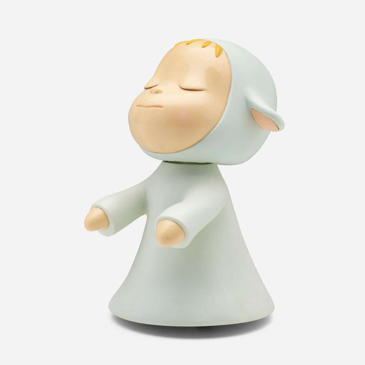
Selected work: Little Wanderer.
Current examples include Little Wanderer, Cosmic Girl and Miss Spring. View the complete Yoshitomo Nara collection for current availability.
Explore available works by Yoshitomo Nara
What changes in translation
A drawing can register hesitation, pressure and revision directly; an edition asks those qualities to survive a repeatable process. In Nara’s strongest prints, simplification does not flatten the character. The interval between a dark contour and a pale ground, or between an eye and the surrounding face, remains psychologically active. That is why technique matters: screenprint, lithography and pigment printing do not merely reproduce an image, but determine edge, density and scale.
How to compare impressions
Establish the exact title, date, medium, sheet size, edition and publisher, then compare the physical impression rather than relying on a familiar image online. Colour, paper tone, margins and surface condition can change how an apparently simple work feels. Ask whether the signature is hand-applied, printed or absent by design, and distinguish original editions from posters or reproductions using related imagery.
Begin by identifying the format accurately
The word print can be used broadly in everyday conversation, but a catalogue needs greater precision. An original edition, an offset poster, a book page and a later reproduction are not interchangeable descriptions. Nara's images also appear on three-dimensional objects. Their shared visual language can make them look related in a website grid while concealing important differences in how they were produced and intended to be encountered.
The selected Little Wanderer, for example, is an open-edition plastic object published by Cerealart, not a work printed on paper. It is relevant as a comparison with Nara's editioned imagery across media. Within the paper catalogue, Cosmic Girl is described as a pair of offset lithographic posters, while Real One is an offset lithograph on a named paper. Those descriptions establish the starting point for looking.
A printed line has its own material life
A drawing can vary with the pressure and movement of a tool across a support. Printing translates the image through another process. A line may become a deposit of ink from a screen, a lithographic mark or a pattern produced by a digital output system. The result can preserve an impression of spontaneity without being physically identical to the original drawn gesture.
This is not automatically a loss. A printing method can emphasise clarity, strengthen a contour or allow a particular scale of colour. What matters is how those qualities serve the composition. Look at the point where a dark outline meets the pale face or surrounding ground. Does the edge feel abrupt, soft or varied? How does its weight compare with the size of the whole sheet? Those relationships shape the character's presence.
Paper is part of the expression
In a sparse composition, a large proportion of what we see may be the support or a lightly printed field. The tone and texture of that area affect the apparent warmth of the image and the intensity of the figure. A bright white ground can create a different encounter from a warmer or visibly textured paper. These are physical properties that a cropped digital image can easily flatten.
The Real One catalogue entry names Classic Linen Solar White Cover paper. That detail invites a more specific enquiry into the object than simply asking whether the image is sharp. Request photographs that show both the complete sheet and a useful surface detail. If texture contributes to the appearance, it should be understood before framing or comparing the work with another publication carrying related imagery.
Margins can make a figure feel alone
The distance between a character and the edge of the sheet affects how it occupies its world. Broad surrounding space may make the figure seem isolated or self-contained. A tighter crop can bring its gaze into more immediate contact with the viewer. These effects are compositional, not merely decorative. A mount that conceals part of the intended margin can therefore change the encounter even when the face remains fully visible.
Use actual dimensions when considering a purchase. Two images displayed at the same size online may differ substantially on the wall. A small figure can invite intimate examination; a larger sheet can make the same economy of line feel assertive. Neither size is inherently better. The question is which relationship between image, support and viewing distance is present in the particular work.
Editioned does not always mean individually signed
A publication may be limited in number without every sheet carrying a hand-applied signature. Another may be an open edition or have no documented production total. The description should state what is known about signing and editioning without substituting one fact for the other. A reproduced signature, a stamped mark and a hand-signature are distinct features, each of which needs to be identified accurately.
For a pair such as Cosmic Girl, confirm whether the offer includes both components and whether their condition is described separately. The gallery records the pair as mounted on board, which matters when considering handling and future framing. Do not assume an apparently flat surface is loose paper. Ask what mounting is present and what examination has been possible.
Preserve the directness without oversimplifying it
Nara's graphic economy can make an edition feel immediately accessible. Yet its apparent simplicity depends on exact intervals between features, the weight of the outline and the balance of the surrounding field. A familiar character should therefore be a reason to look more carefully, not a reason to treat every appearance as equivalent. Publication details tell us how the image became this object; close looking shows what that translation makes possible.
Use the related drawing essay to explore the role of line, and the collecting guide for documentation and condition questions. Together they offer a way to appreciate the intimacy of Nara's imagery while keeping the distinction between paper editions, posters and objects clear.
Keep the complete publication title in your records even if you use a shortened name in conversation. Similar-looking images and informal titles can become difficult to distinguish later, especially when photographs circulate without their original catalogue descriptions. Precise naming supports the same careful attention that the images invite.


Leave a comment
This site is protected by hCaptcha and the hCaptcha Privacy Policy and Terms of Service apply.